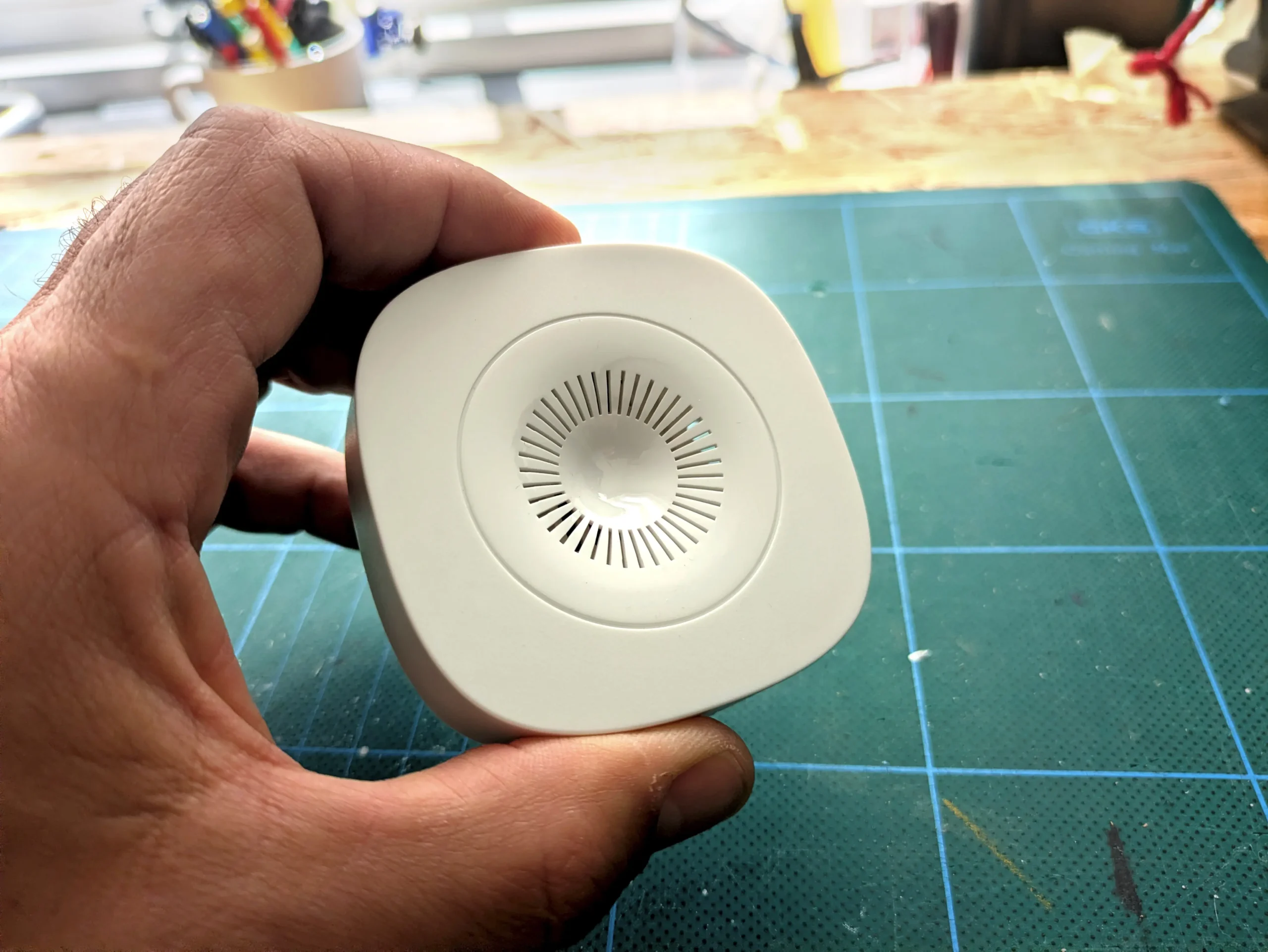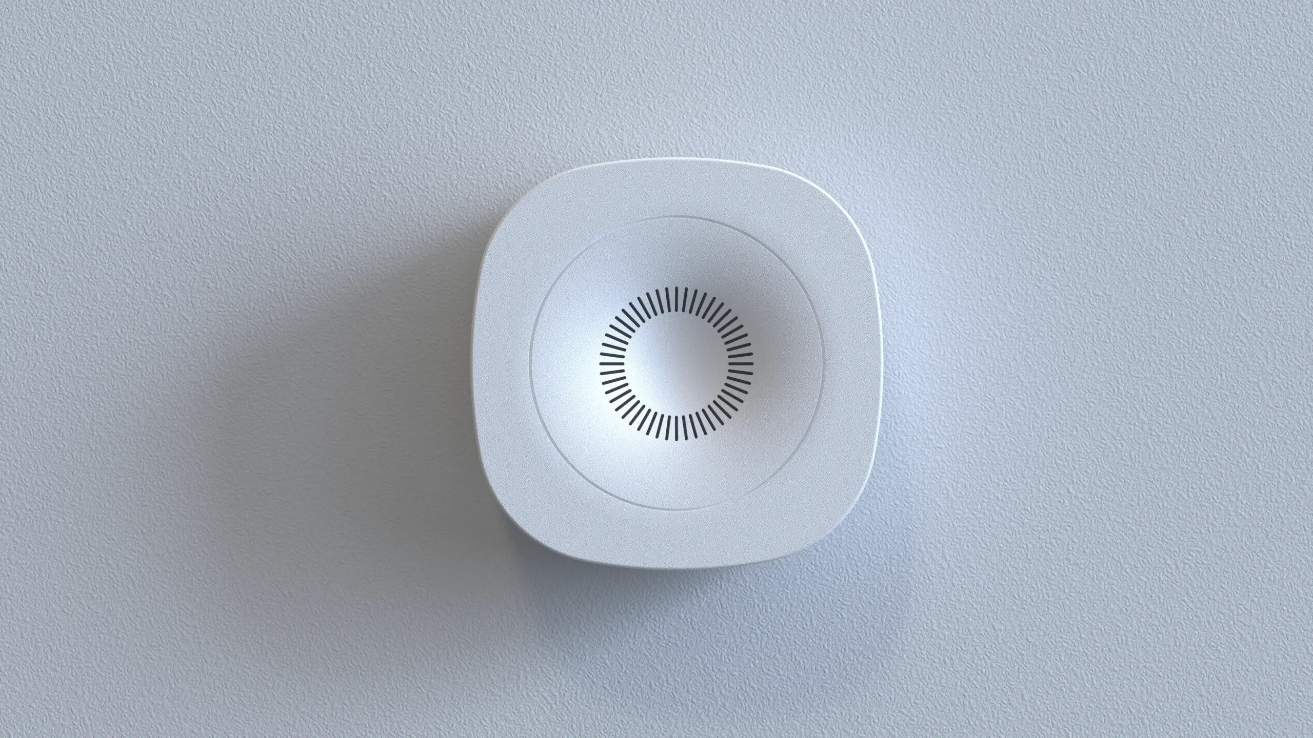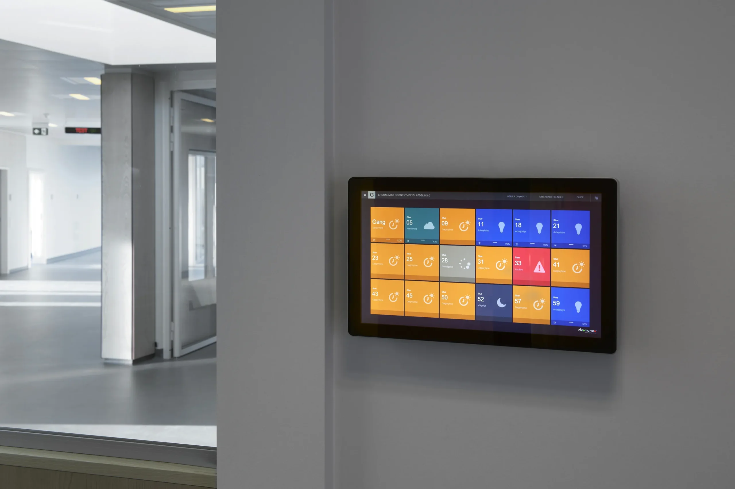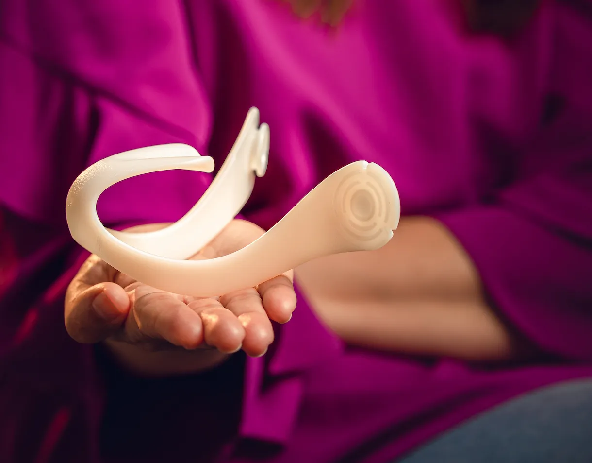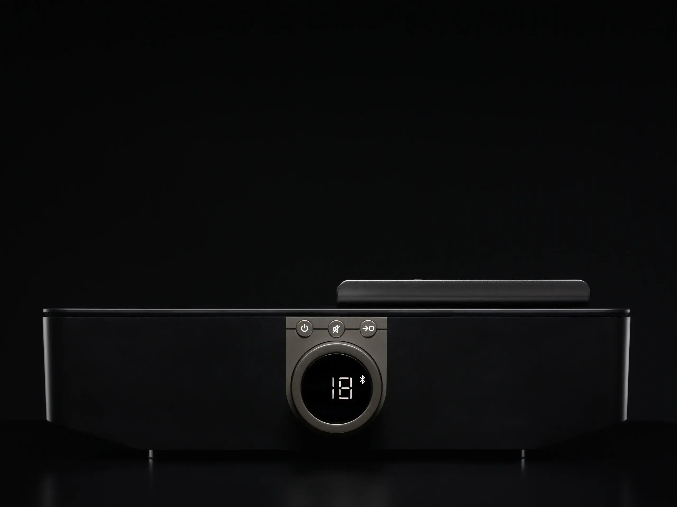
Aguardio Shower Sensor

Services

-> Product design
-> HMI design

Client

Aguardio

Year

2020

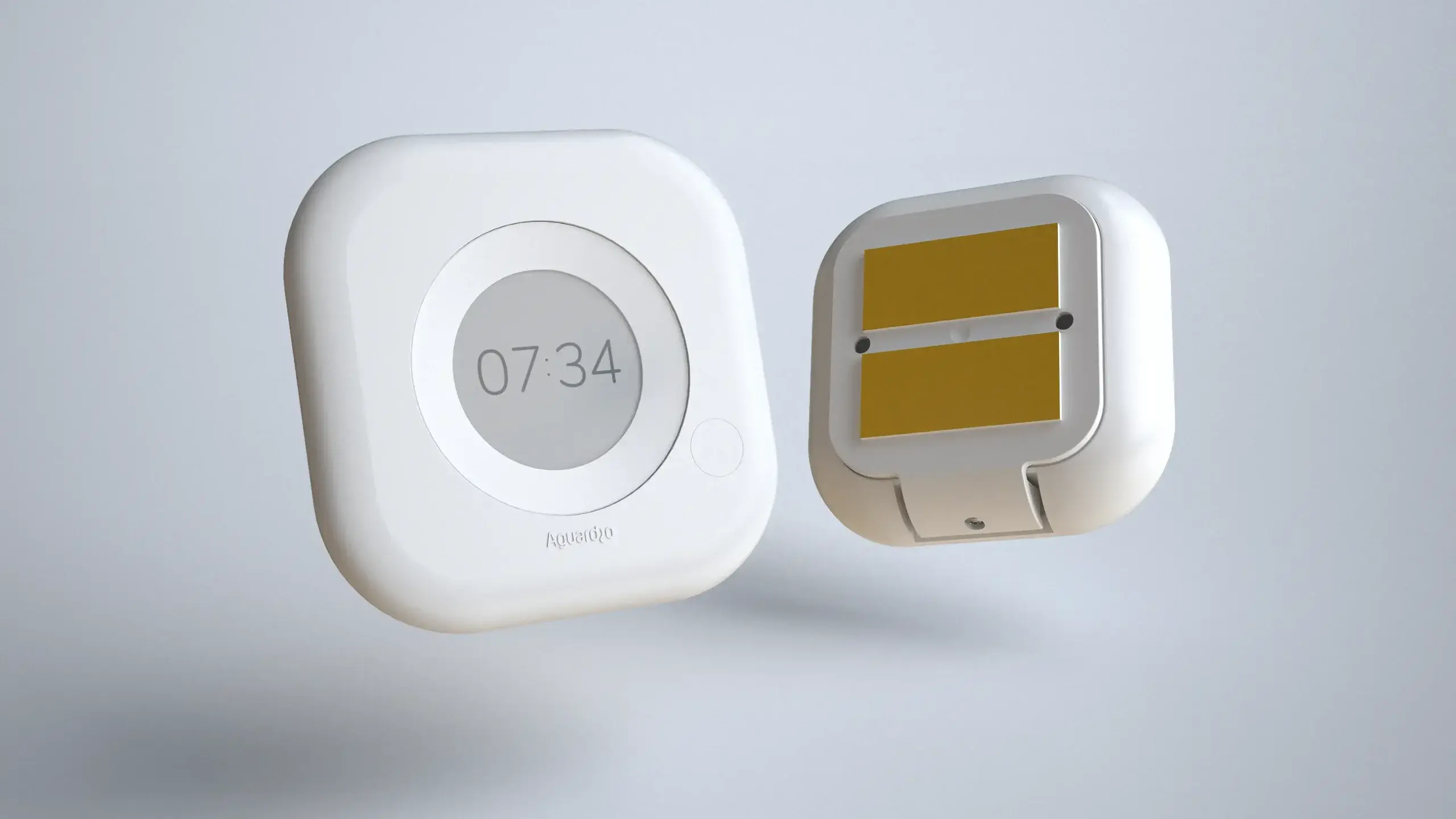
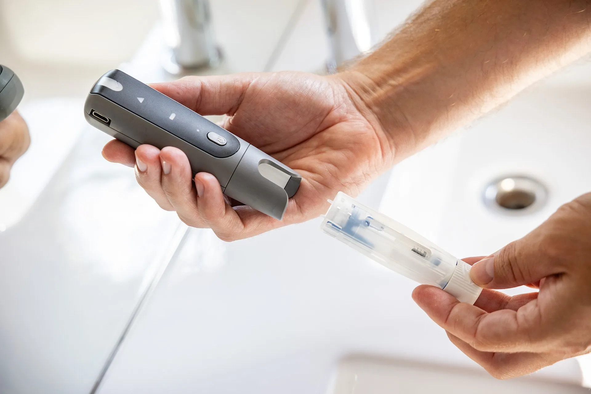
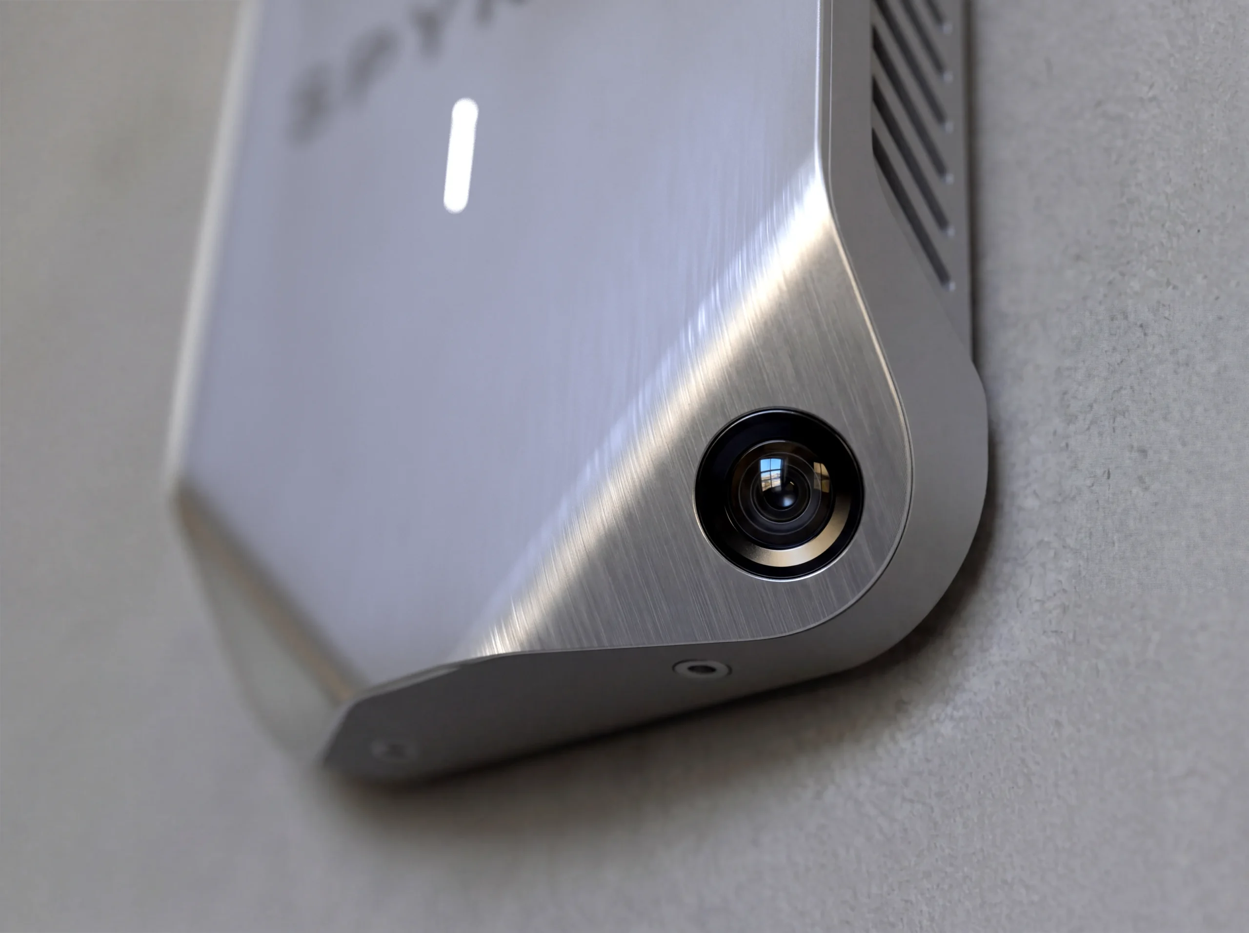
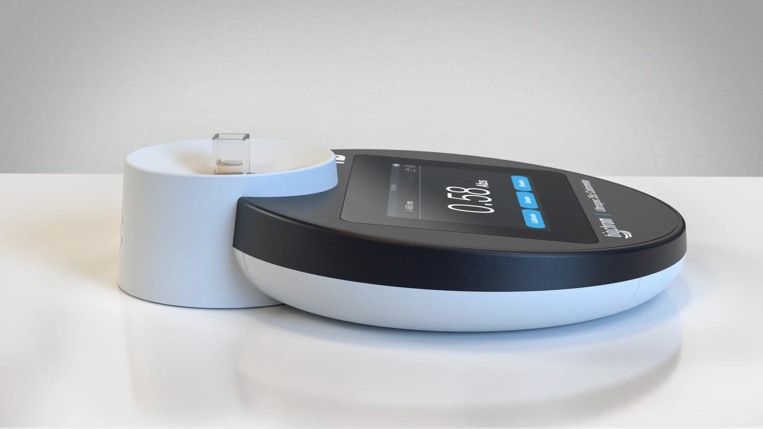
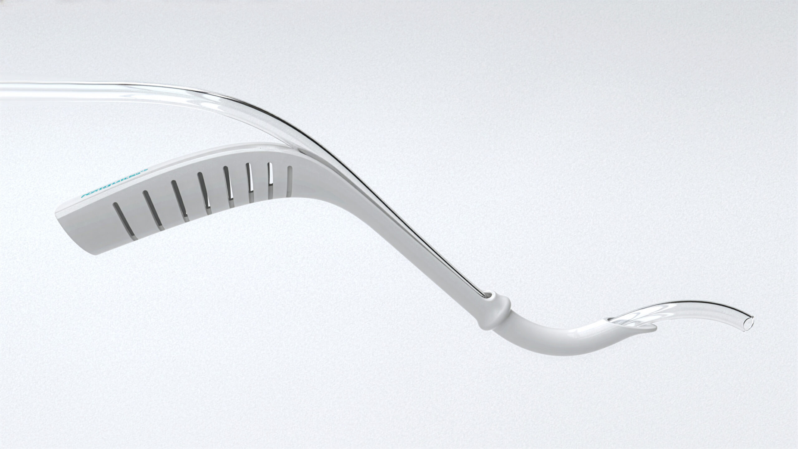
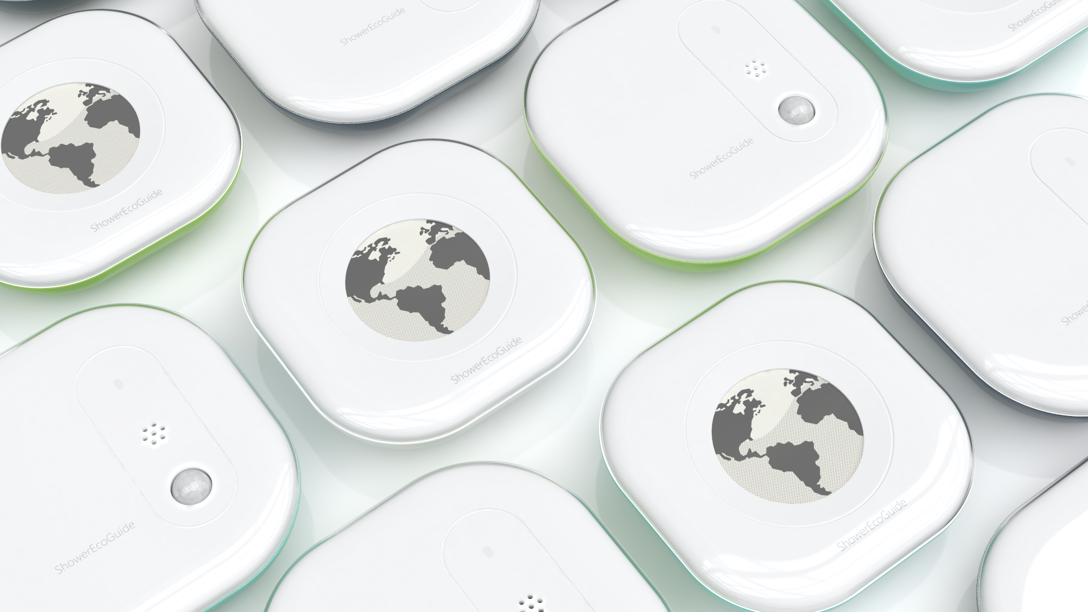
The task was to design a compact, battery-powered sensor that mounts easily inside any shower. It needed to detect humidity and water use accurately without requiring plumbing or hardwiring, all while surviving a constantly wet environment.

Our role

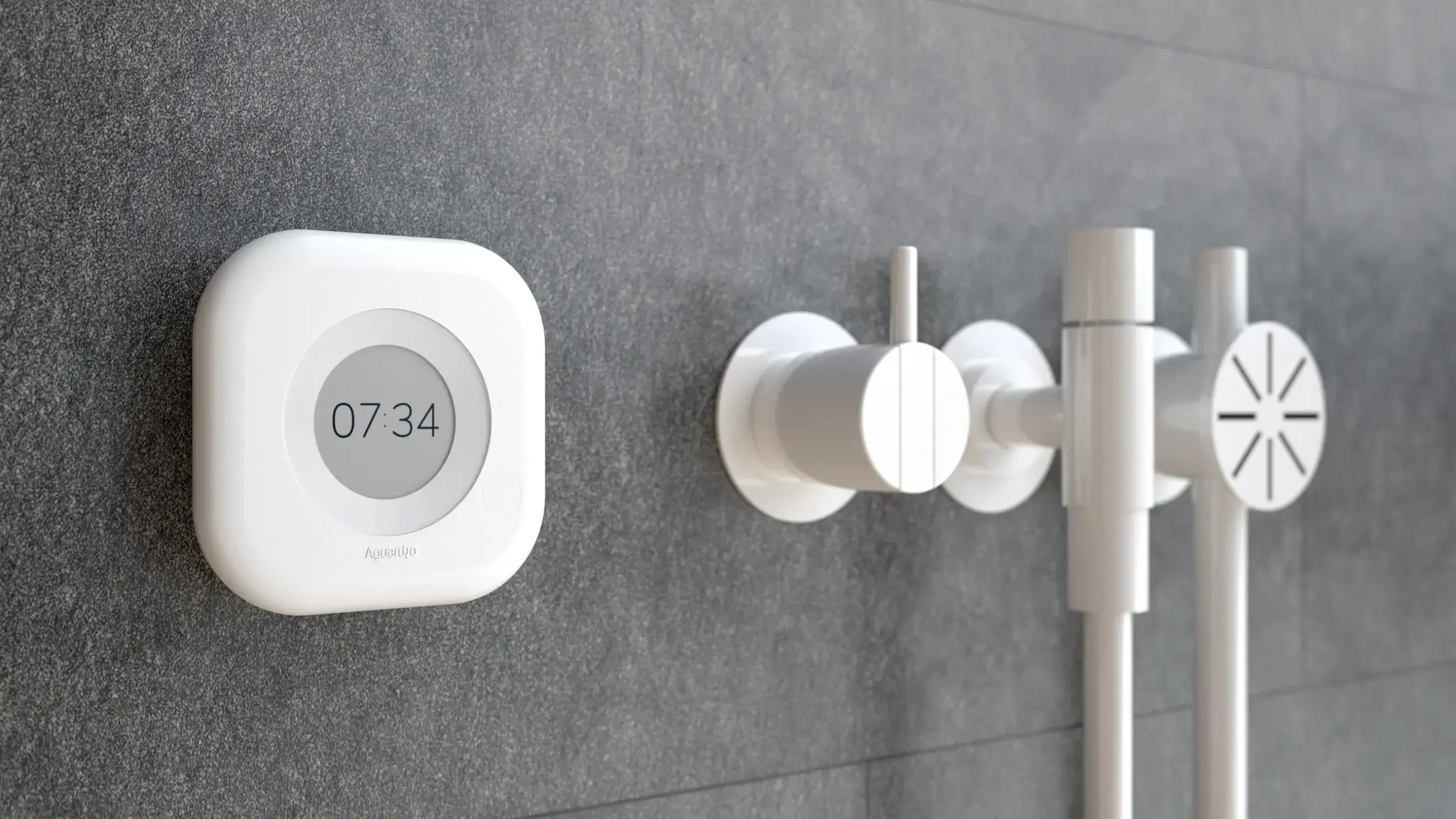
Made By Makers handled the industrial design and user experience. We focused on creating a clean, discreet Scandinavian design that feels natural in a modern bathroom rather than looking like a piece of utility equipment.

Process

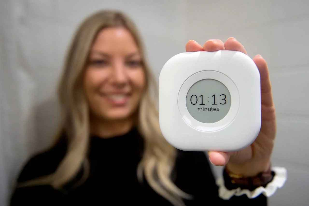
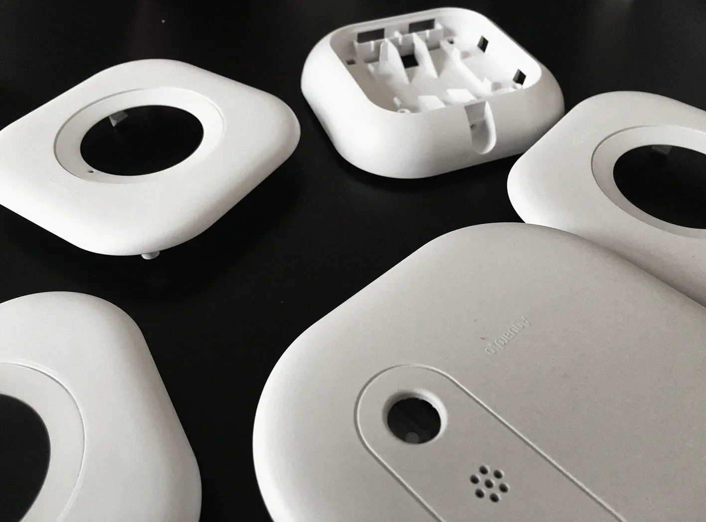
We worked closely with Aguardio to combine durable materials, waterproof sealing, and intuitive feedback. The display was engineered to deliver instant, clear timing data that gently prompts shorter showers without feeling intrusive.

Result

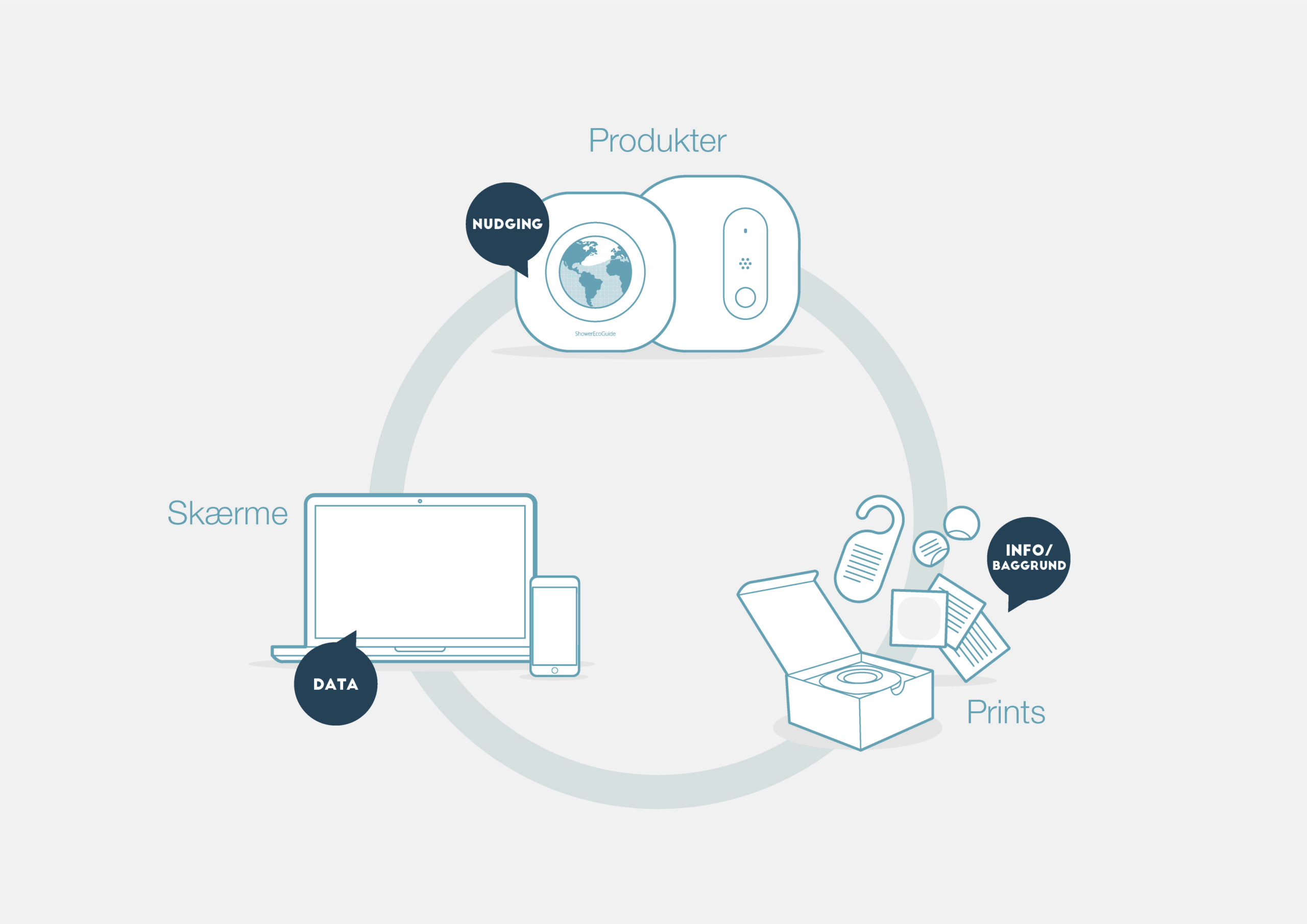
The Aguardio Shower Sensor brings together behavioral nudge technology and simple, timeless design. It offers both residential and commercial users an easy way to save water and energy with a sleek, self-installed device.
Client

Aguardio creates smart technology designed to make everyday life more sustainable. Their mission is to lower water and energy use in homes and hotels by giving people real-time awareness of their showering habits.
Explore more

View examples of our client cases

swIMAGINE

Wearable exercise system

SurgeryTech

Katscope

Sarstedt

Tempus1800®

BLINDCASE – VELUX

Client

VELUX

Since

2023

VELUX is a global leader in roof windows, skylights, and daylighting solutions for residential and commercial buildings. The company is known for its innovative products that improve indoor environments through natural light, fresh air, and energy-efficient design. With more than 80 years of experience, VELUX supports sustainable building practices and enhances living spaces for millions of people worldwide.  

Made By Makers have been working together with the Velux development team on multiple projects spanning from smaller iterative design sprints, stimuli creation for large user research studies to large strategic projects focusing on key VELUX offerings.

Onics – Audio Assistant

Services

-> Design DNA
-> Product design
-> Design for manufacturing

Client

Onics

Year

2021

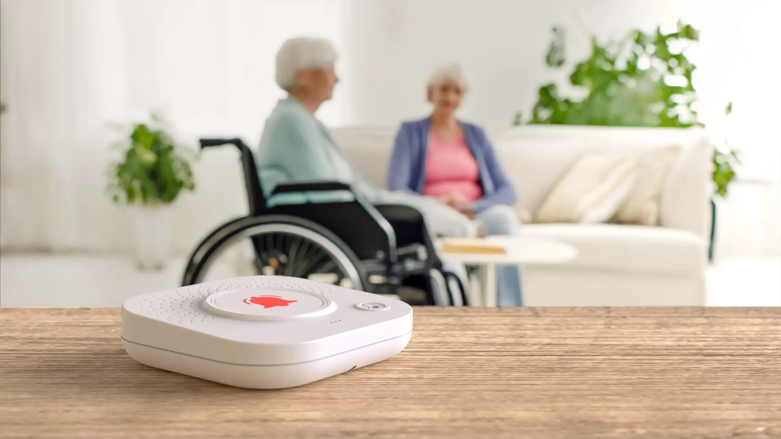
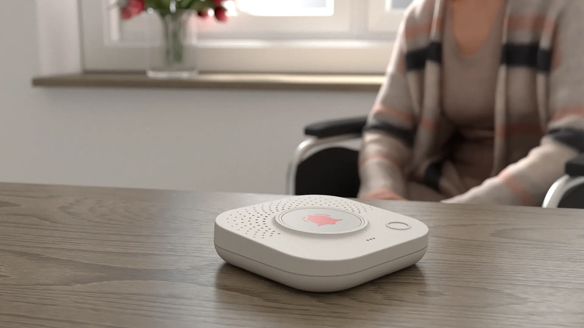
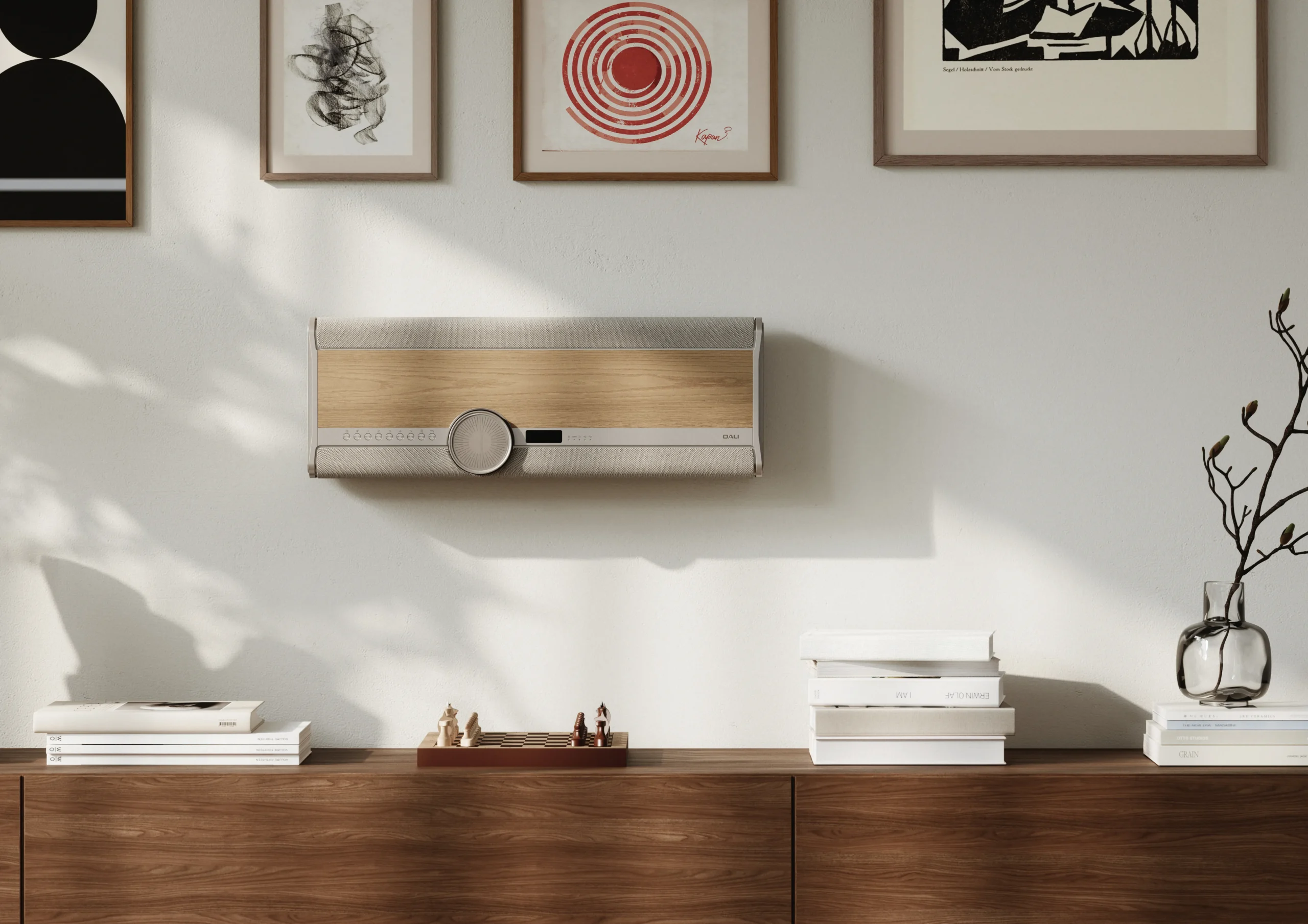
The challenge was to design an Audio Assistant for elderly people living independently at home or in a care home, providing a simple and reliable way to get in contact with people outside their home, such as an Alarm Receiving Center. The interaction needed to be highly intuitive and reassuring, so that even in stressful or emergency situations, the user could understand and operate the product with confidence.

Our role

Our role was to translate the complexity of an emergency communication system into a simple and approachable physical product. The design needed to communicate its purpose immediately, while creating a sense of familiarity, trust, and calm for users who may not be comfortable with technology.

Process

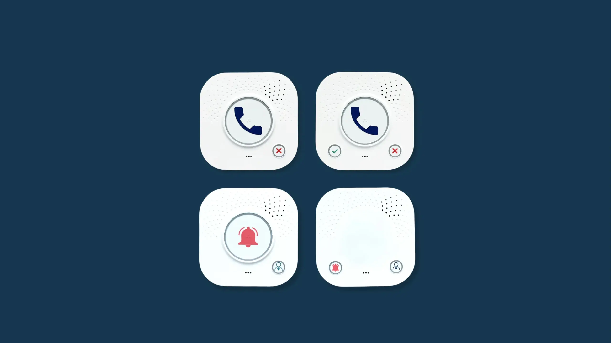
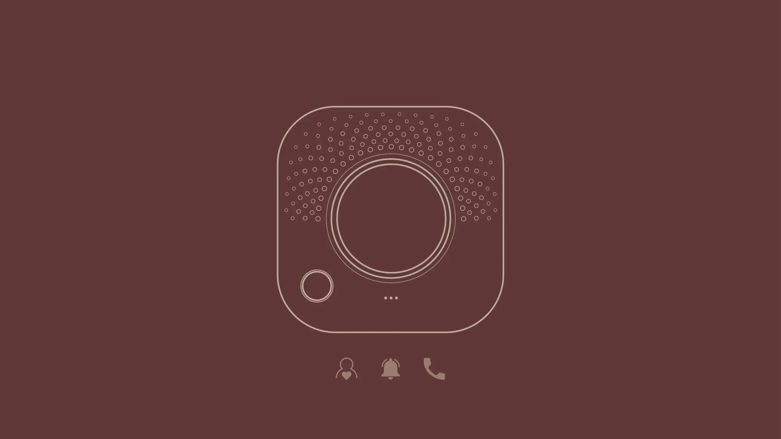
The design process focused on making the interaction as intuitive as possible. We explored how the physical form, button placement, feedback, and visual cues could work together to guide the user without requiring instructions or prior knowledge. Particular attention was given to emergency situations, where clear affordances and a predictable interaction are essential.

Result

Together with Onics, we developed an Audio Assistant with a clear and approachable expression, where the physical design makes the primary interaction immediately understandable. The result is a reassuring and easy-to-use product that enables elderly users to quickly call for help when they need it, while fitting naturally into both private homes and care environments.
Client

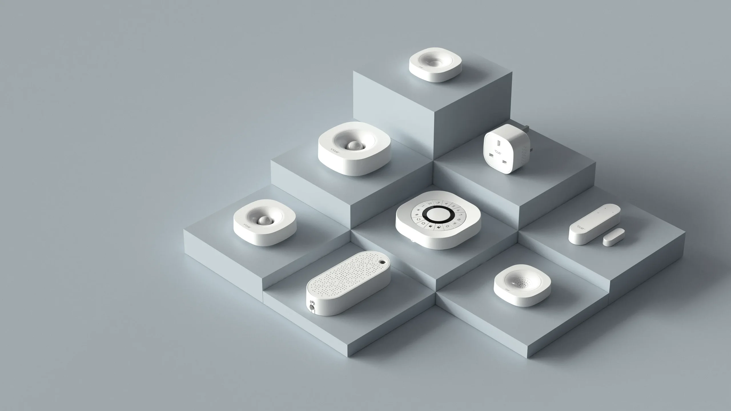
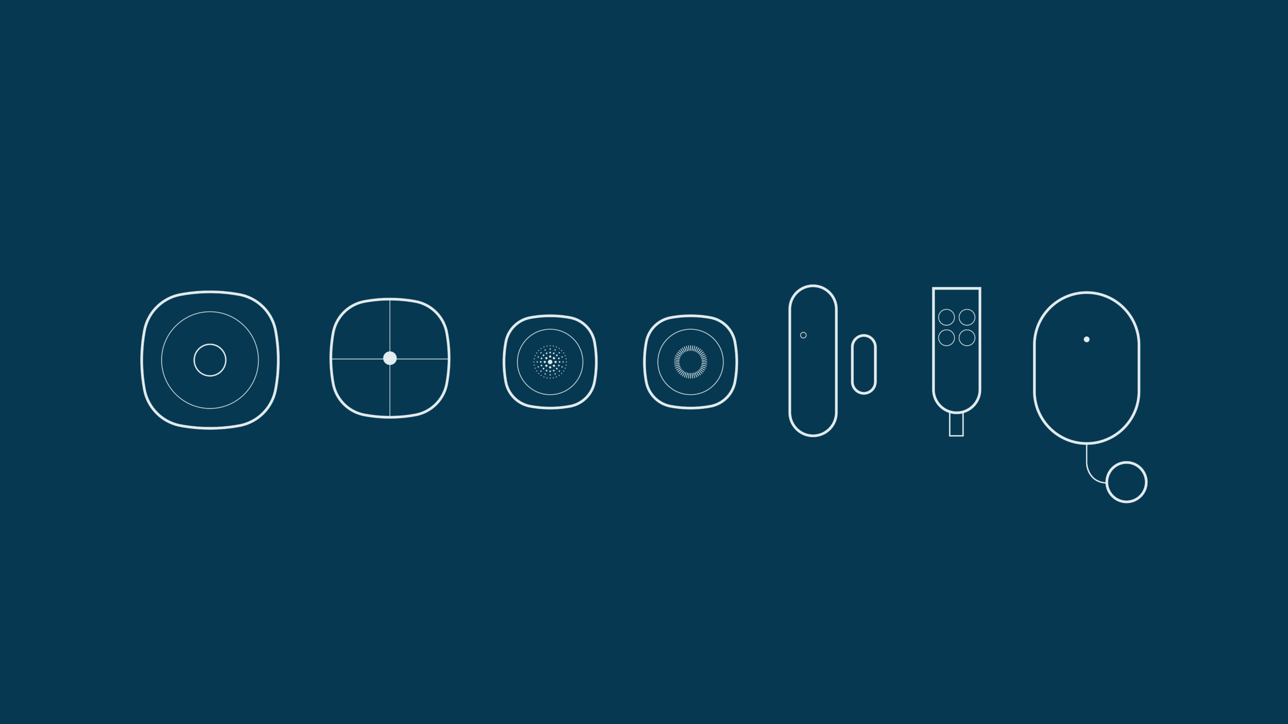
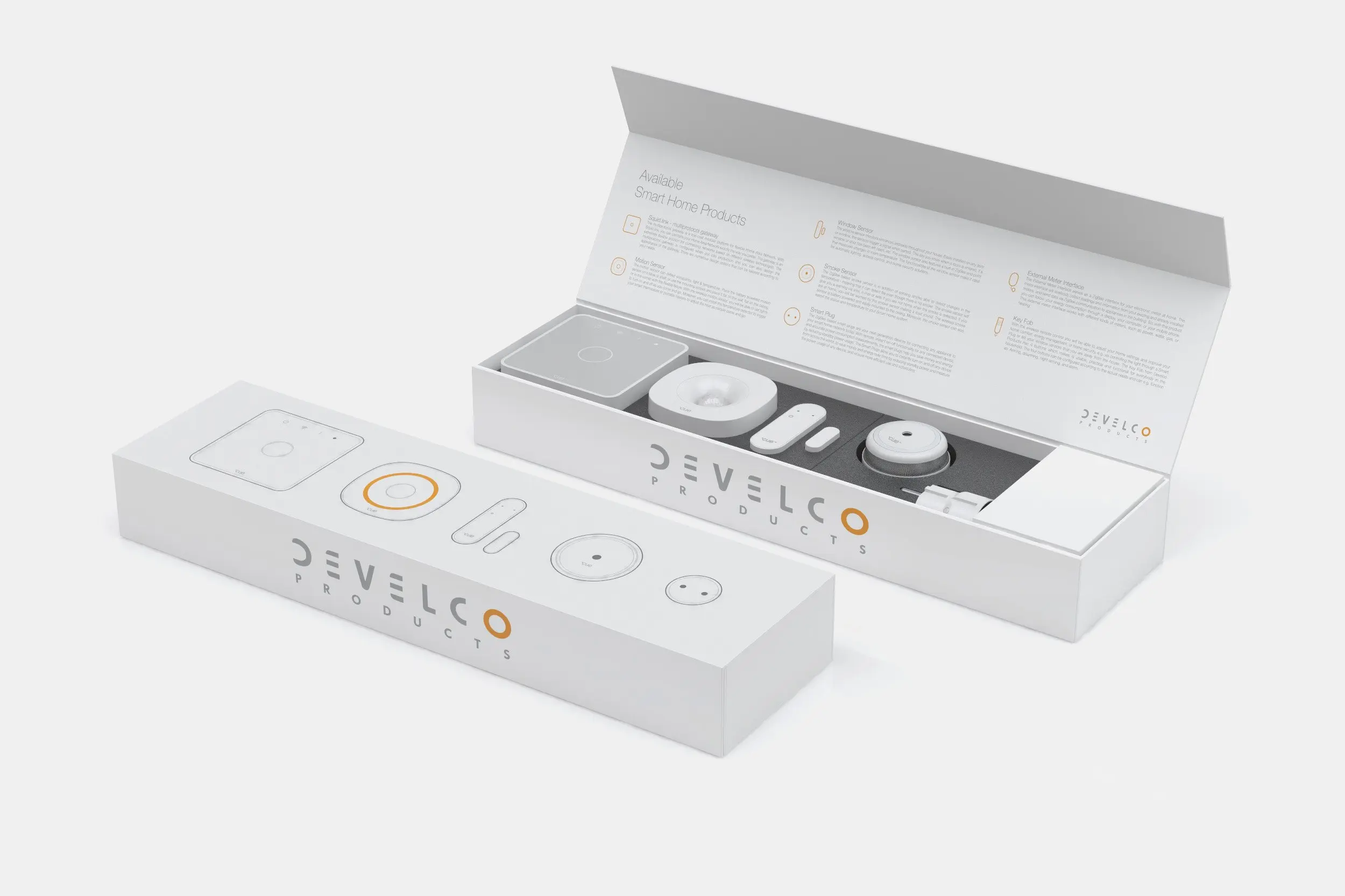
Onics delivers comprehensive B2B IoT solutions, providing the hardware, software, and cloud platforms that power smart home, energy management, and healthcare technologies. They specialize in white-label devices -including gateways, sensors, and smart plugs - allowing businesses to seamlessly brand and deploy their own connected solutions.
Onics Visual Identity

Services

-> Visuel identity
-> Brand guidelines

Client

Onics

Year

2025

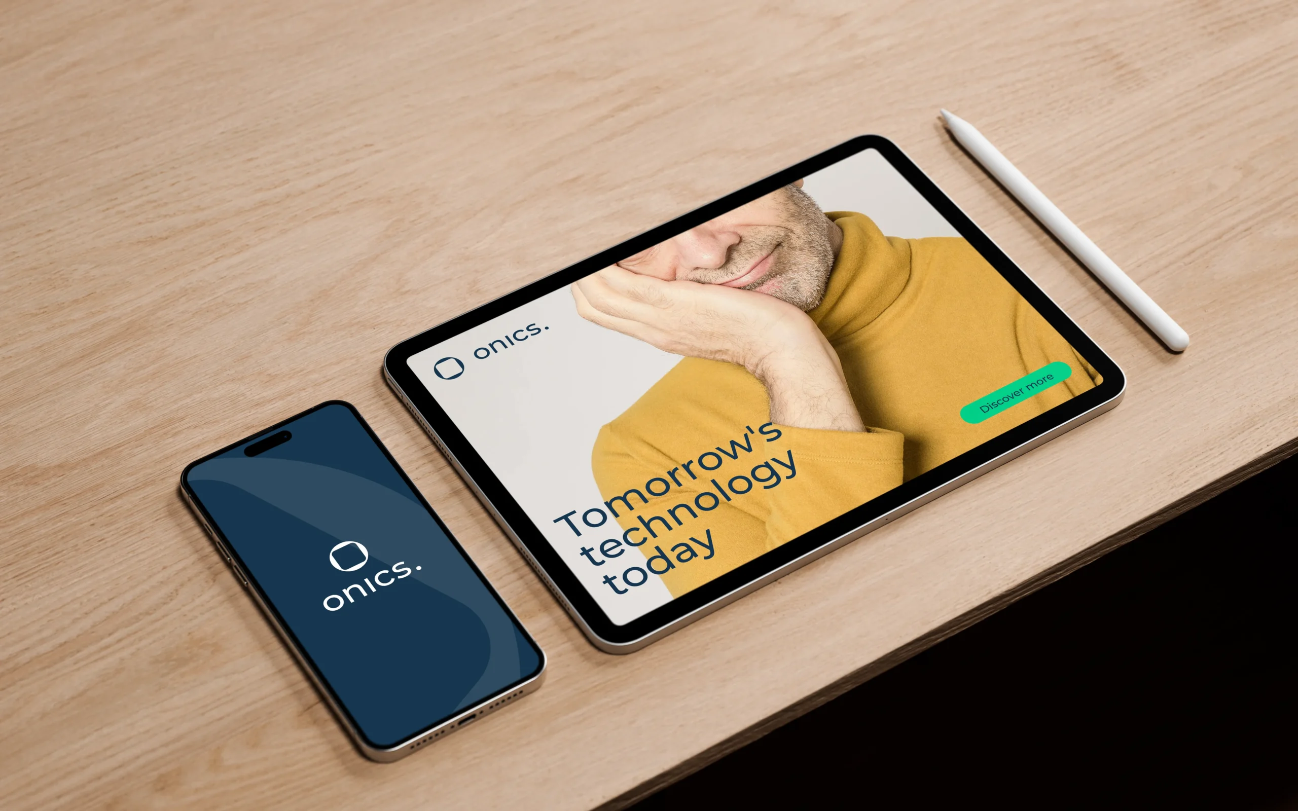
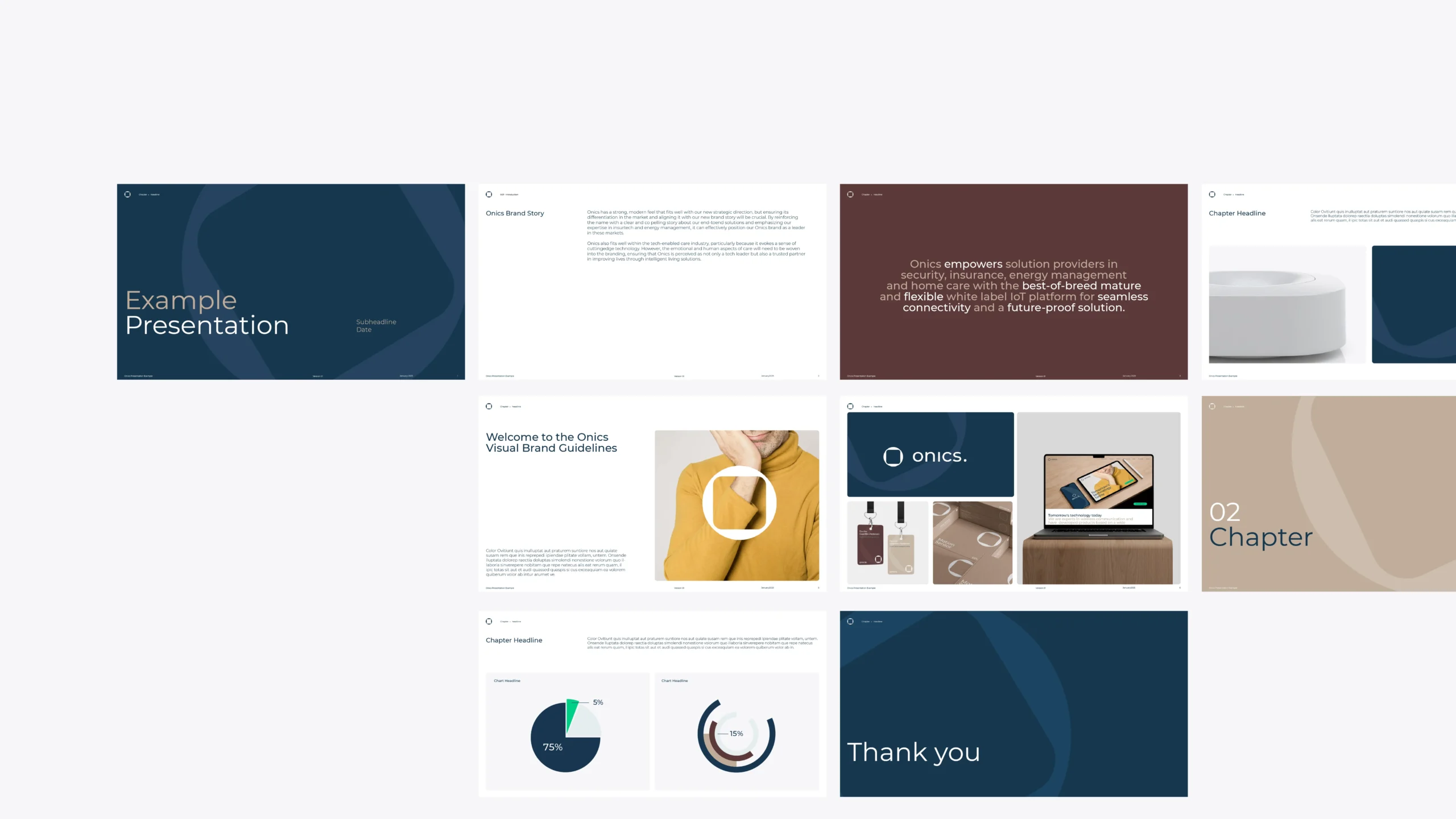
Following the merger of Develco Products and Datek Smart Home, Onics required a new visual brand transformation. The core challenges lied in establishing a cohesive visual identity that balances technical precision with approachable usability. This involved a new logo design and a set of visual brand guidelines.

Our role

We translated Onics’ core values into a unified, standardized visual brand guide. The focus was to create a flexible, easy-to-use design system to ensure consistency across all future assets.

Process

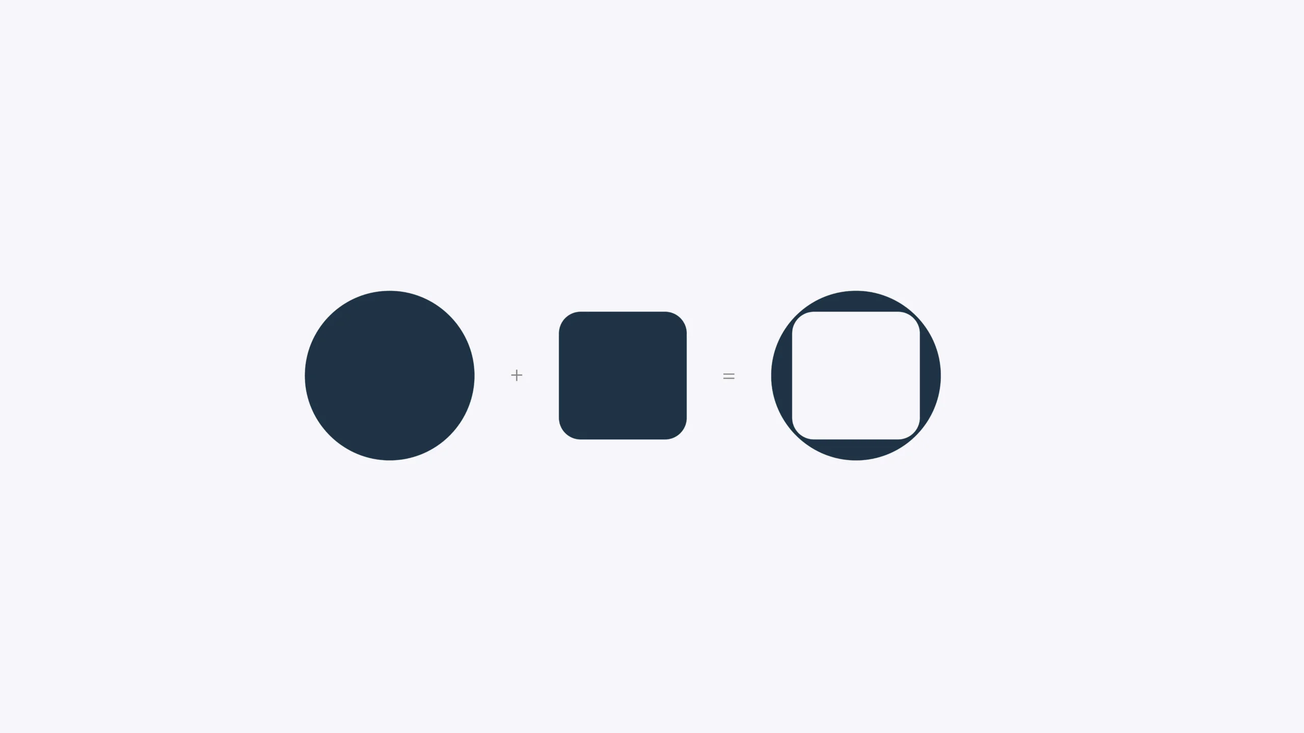
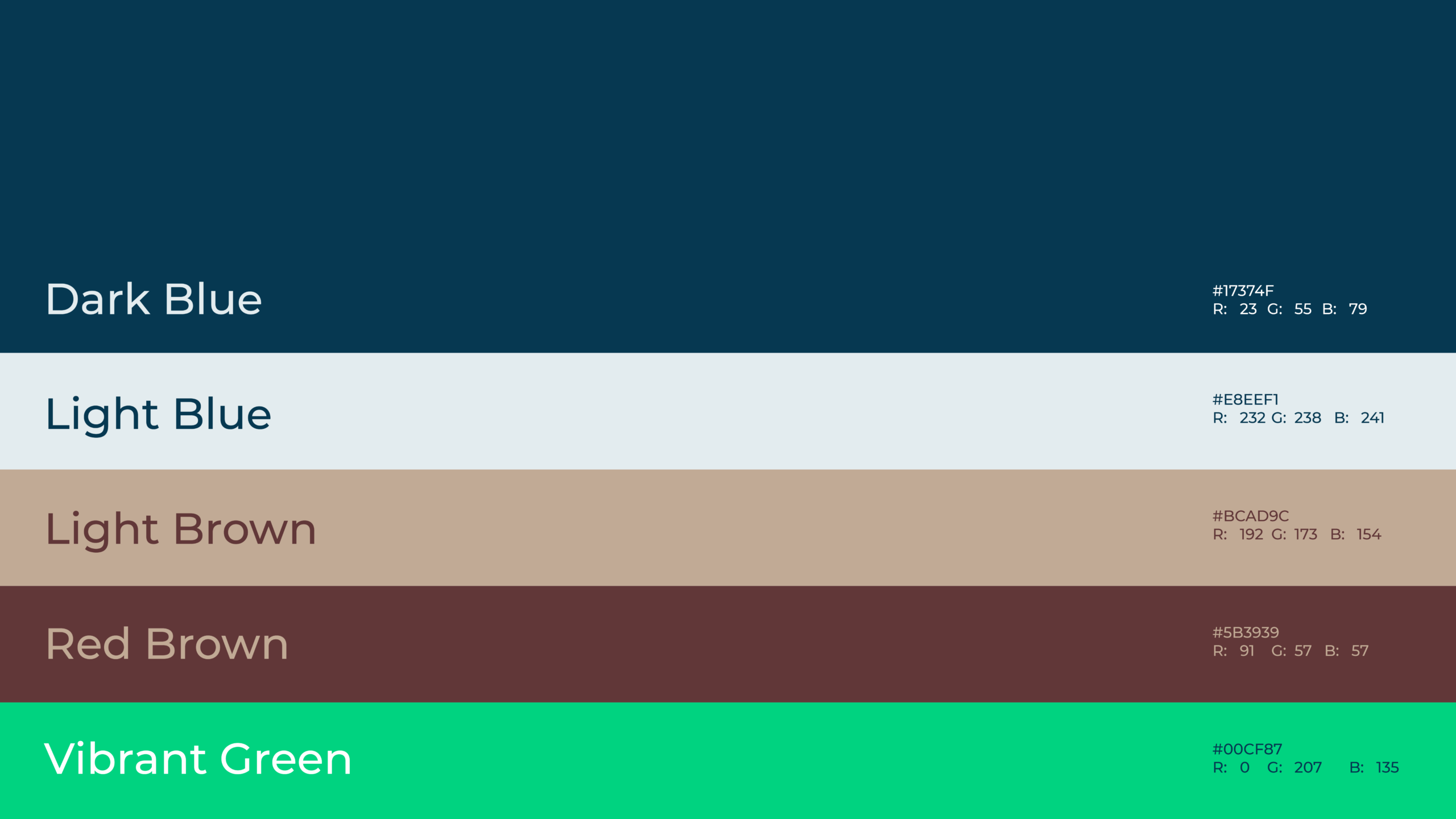
We began by exploring two distinct visual directions and sketching out a new logo mark, which conceptually bridges a rigid square (representing hardware) with a fluid circle (representing software and the letter 'O'). Once a direction was selected, we translated Onics’ brand values into comprehensive visual guidelines, defining a versatile typographic system, a balanced color palette, and clean photography standards.

Result

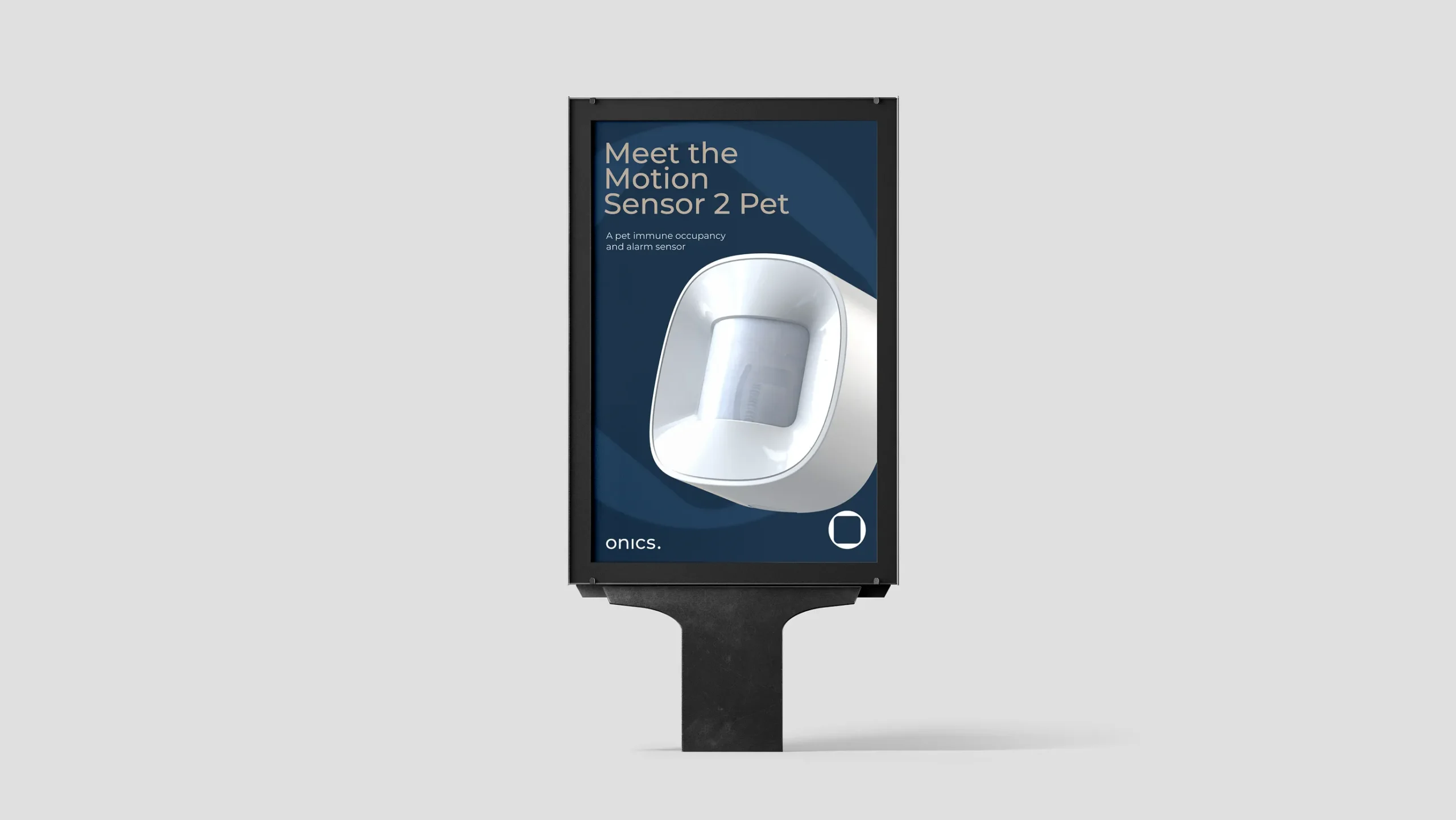
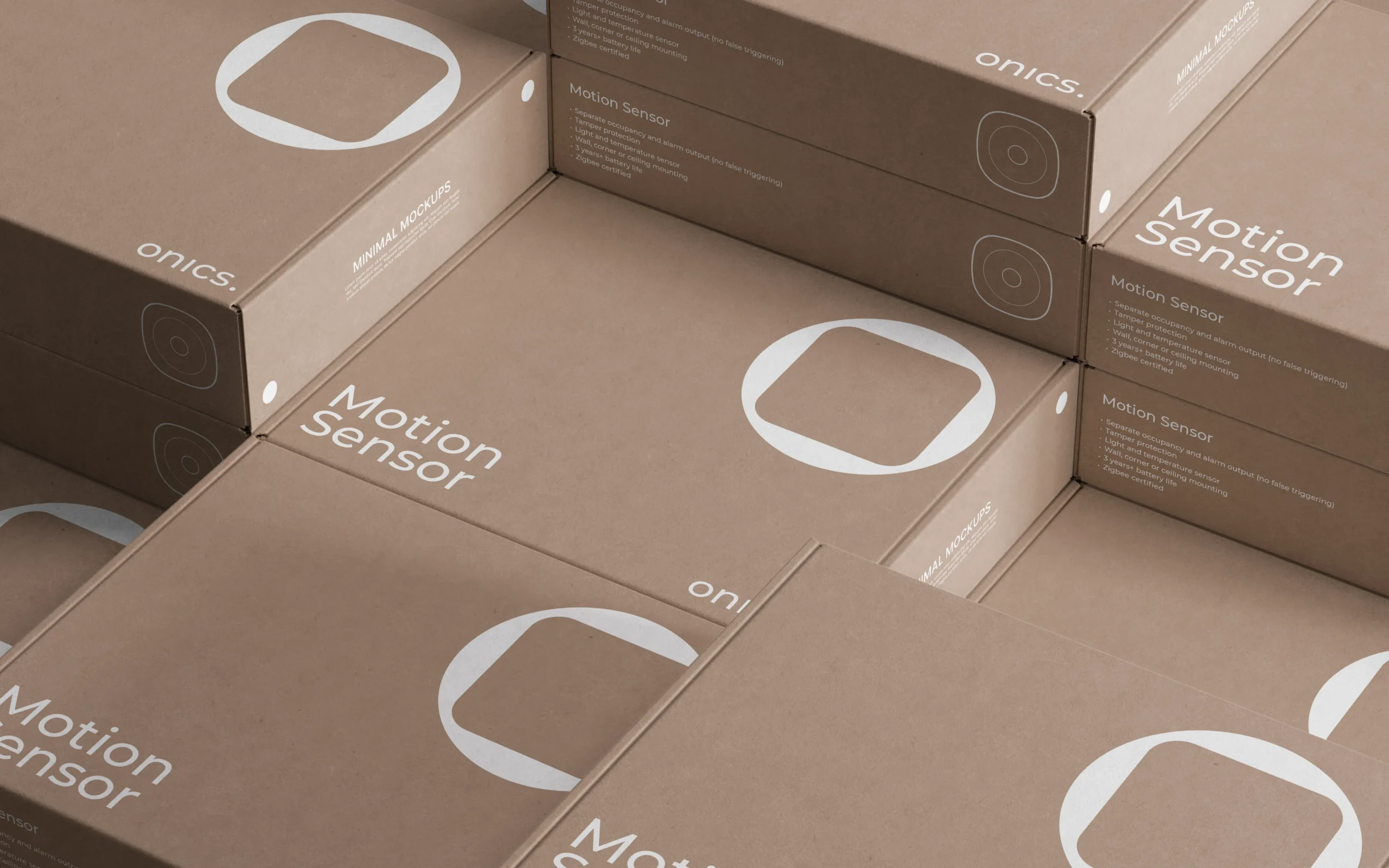
The resulting identity and visual guidelines provide a scalable framework for Onics’ future visual touchpoints. The logo is optimized with versatile vertical and horizontal lockups and strict clearspace rules to protect brand integrity. Typography and color systems are designed for high readability, while product photography and UI layouts maintain a clean, minimal aesthetic with ample breathing room. Finally, the "Mega Logo Mark" was established as a bold, recognizable graphic asset to anchor the platform's overarching identity.

Client

Onics delivers comprehensive B2B IoT solutions, providing the hardware, software, and cloud platforms that power smart home, energy management, and healthcare technologies. They specialize in white-label devices -including gateways, sensors, and smart plugs - allowing businesses to seamlessly brand and deploy their own connected solutions.

Onics Entry Sensor

Services

-> Design DNA
-> Product design
-> Design for manufacturing

Client

Onics

Year

2015

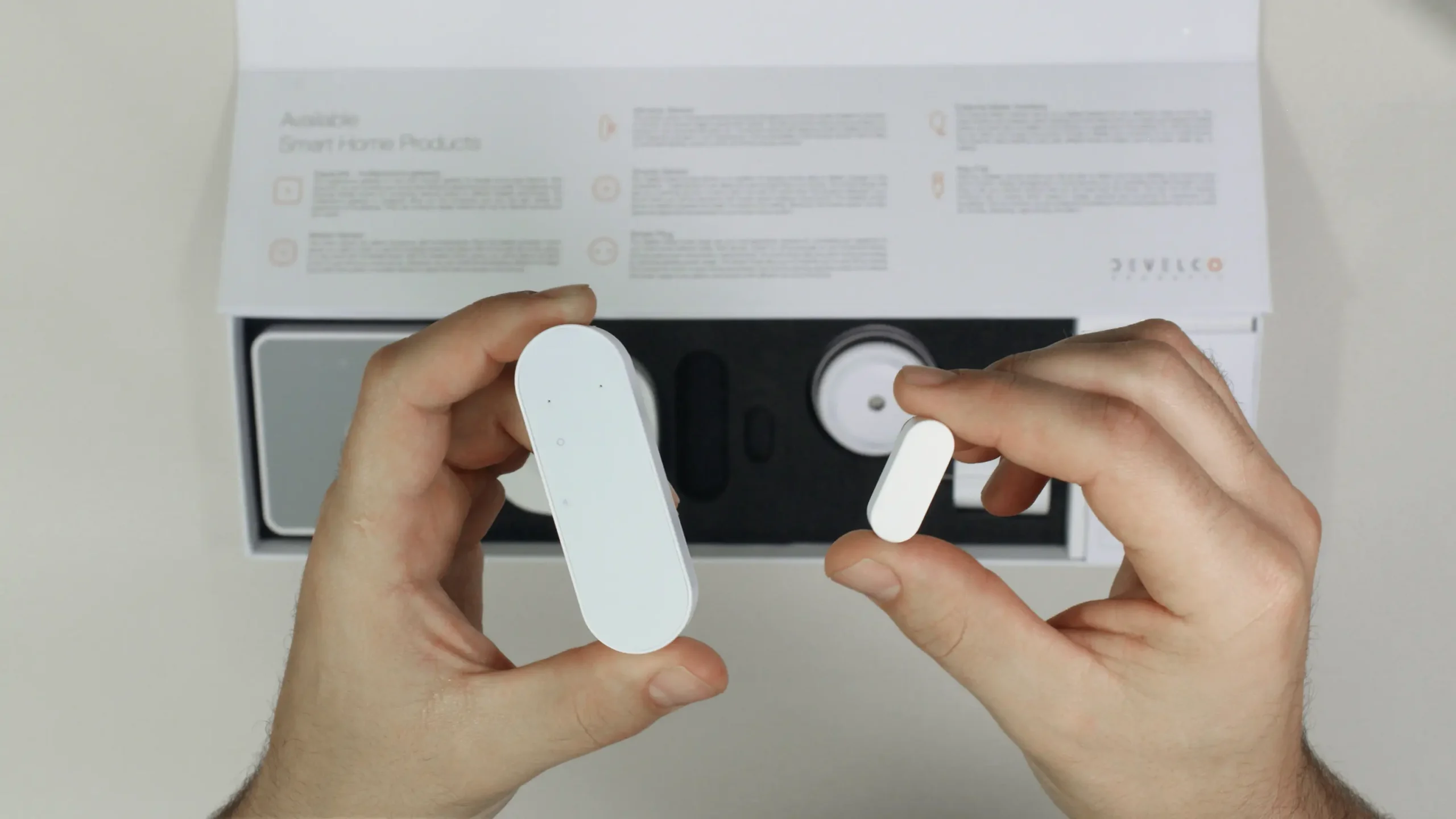
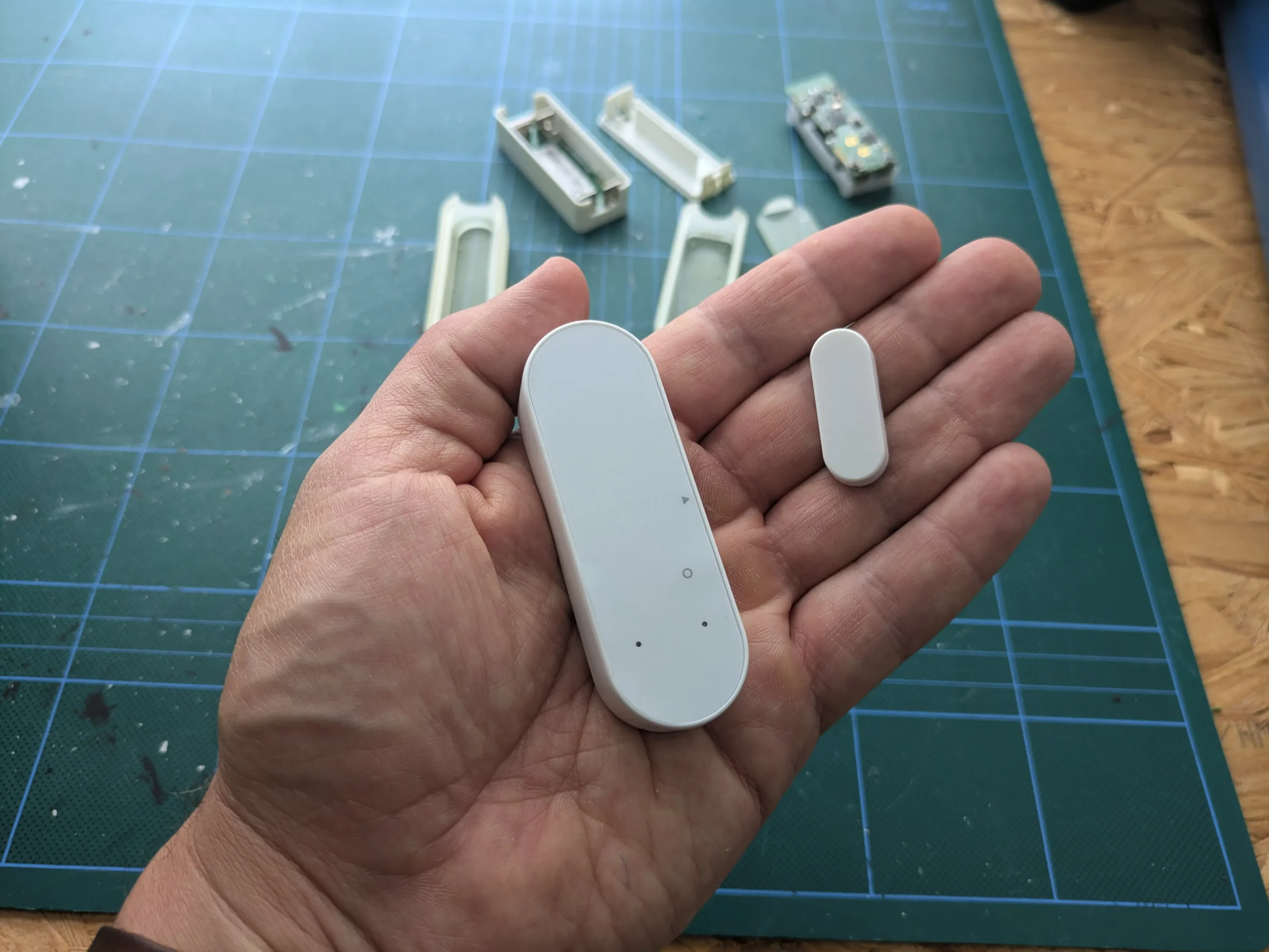
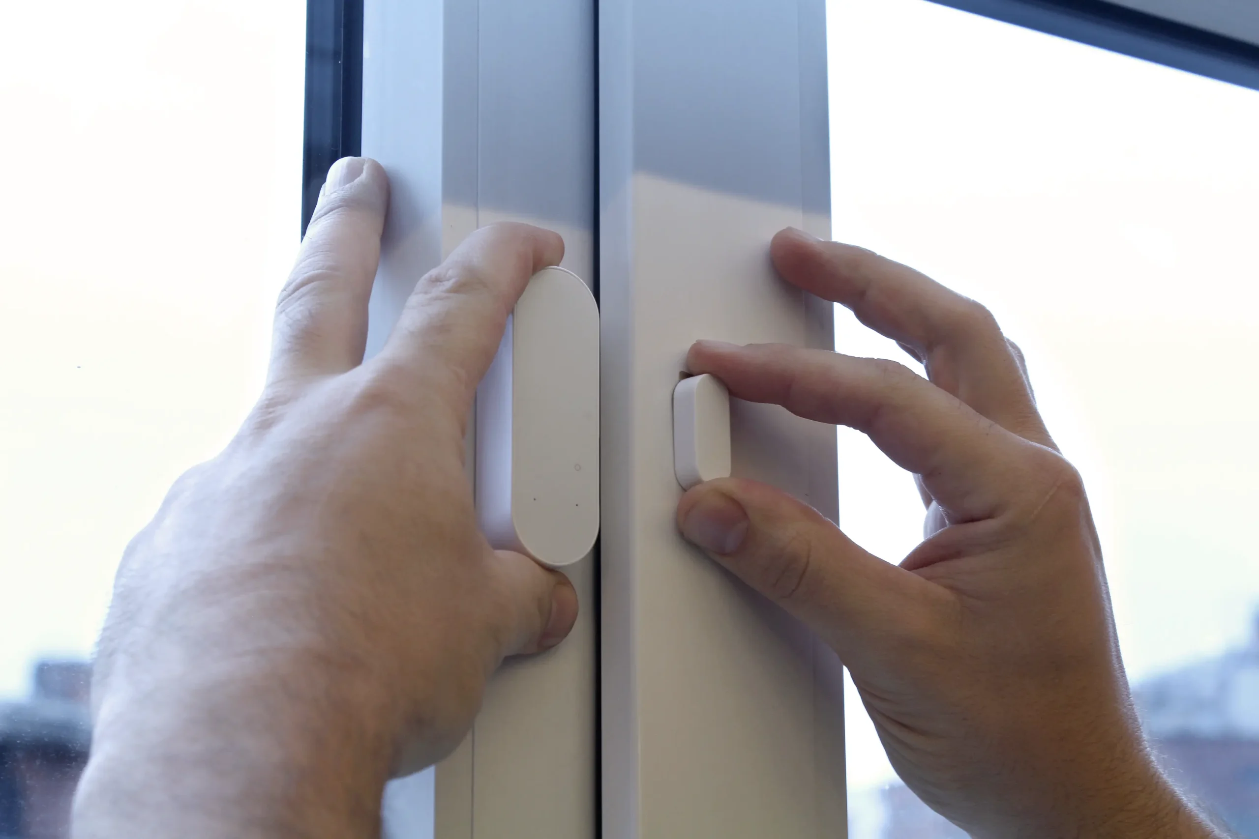
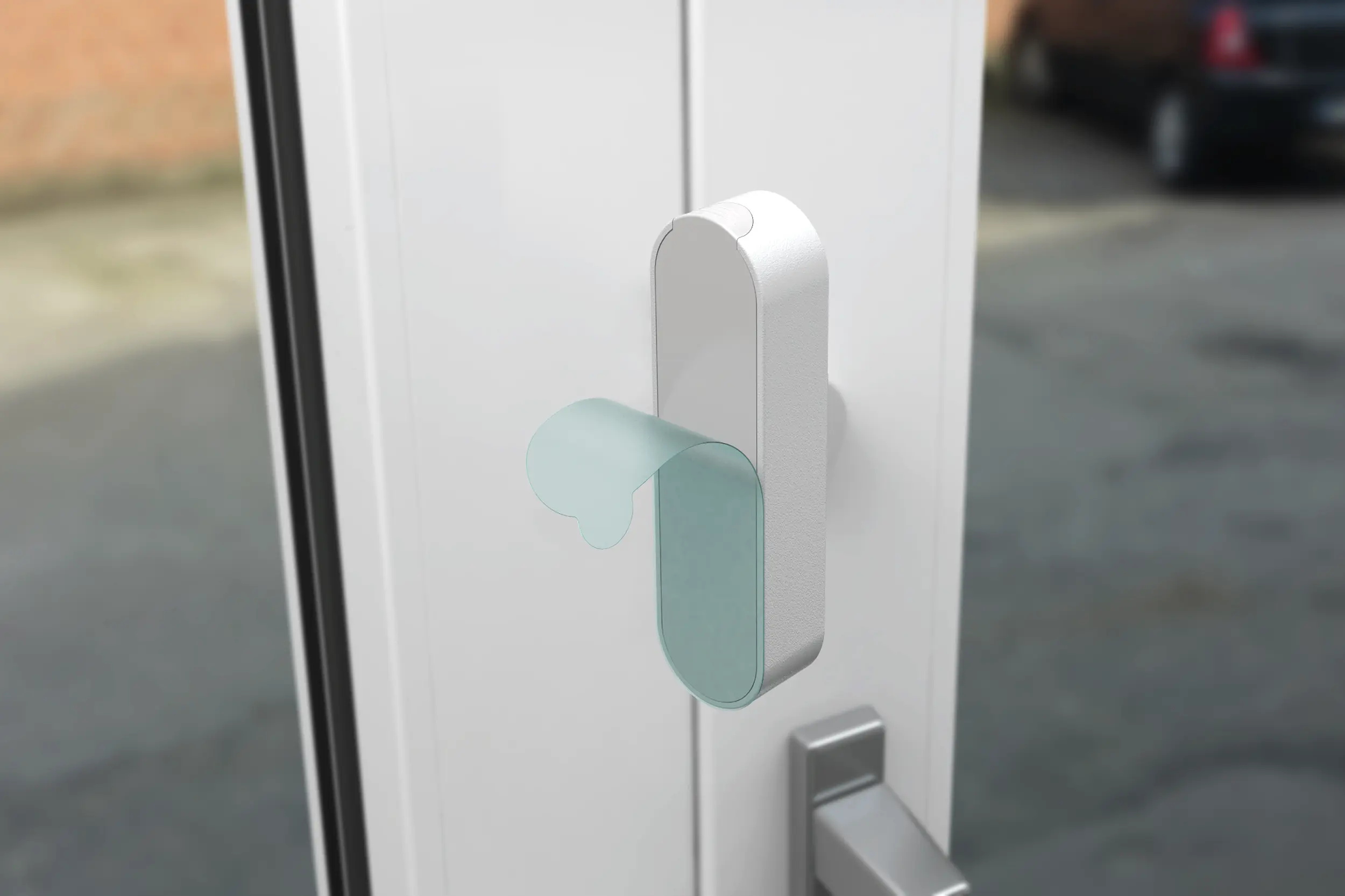
The challenge was to design a compact and discreet Entry Sensor consisting of two separate devices, one mounted on the door or window and the other on the frame. Both elements needed to feel visually connected and belong together as a single, coherent product, while integrating seamlessly into a wide variety of interiors and surroundings and maintaining a minimalistic aesthetic with a clear connection to the established design language of other Onics products.

Our role

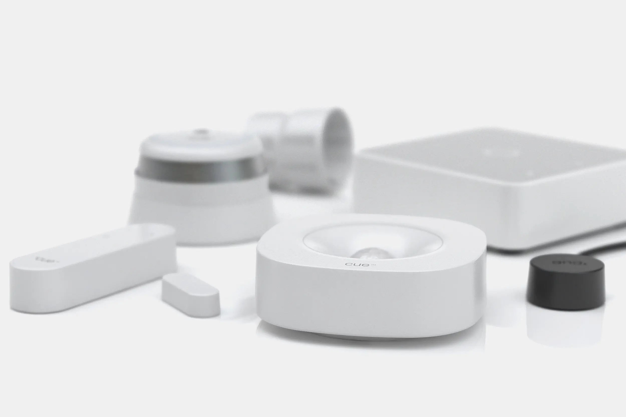
The Entry Sensor builds on the design DNA established with the Motion Sensor, translating its distinctive forms, proportions, and visual details into a smaller two-part product. By carrying these design cues across both the sensor and its counterpart, the two elements feel visually connected while creating a clear and consistent relationship to the wider Onics product range.  

Process

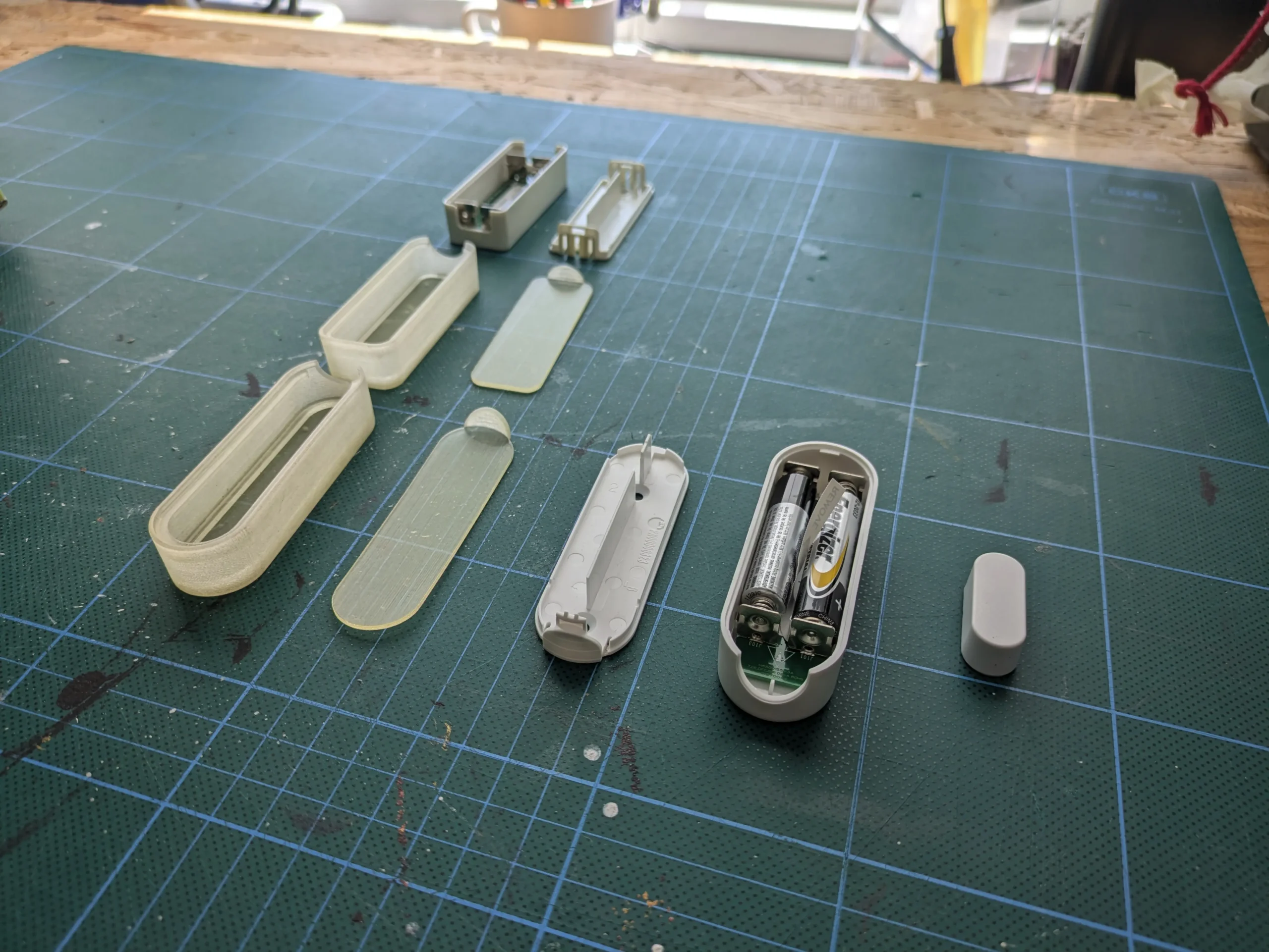
The concept development explored several directions, from more expressive, identity-driven designs to an “as small as possible” approach, while balancing the practical demands of installation across different types of windows and doors with considerations for ease of assembly, component integration, and manufacturability. 

Result

Together with Onics the choice was a design that is not as small as possible, but by adding just a small geometric circular ending to the pair of sensors ends up being visually strong and iconic and still compact enough to be mounted discretely.  

Client

Onics delivers comprehensive B2B IoT solutions, providing the hardware, software, and cloud platforms that power smart home, energy management, and healthcare technologies. They specialize in white-label devices -including gateways, sensors, and smart plugs - allowing businesses to seamlessly brand and deploy their own connected solutions.

Onics Motion Sensor

Services

-> Design DNA
-> Product design
-> Design for manufacturing

Client

Onics

Year

2015

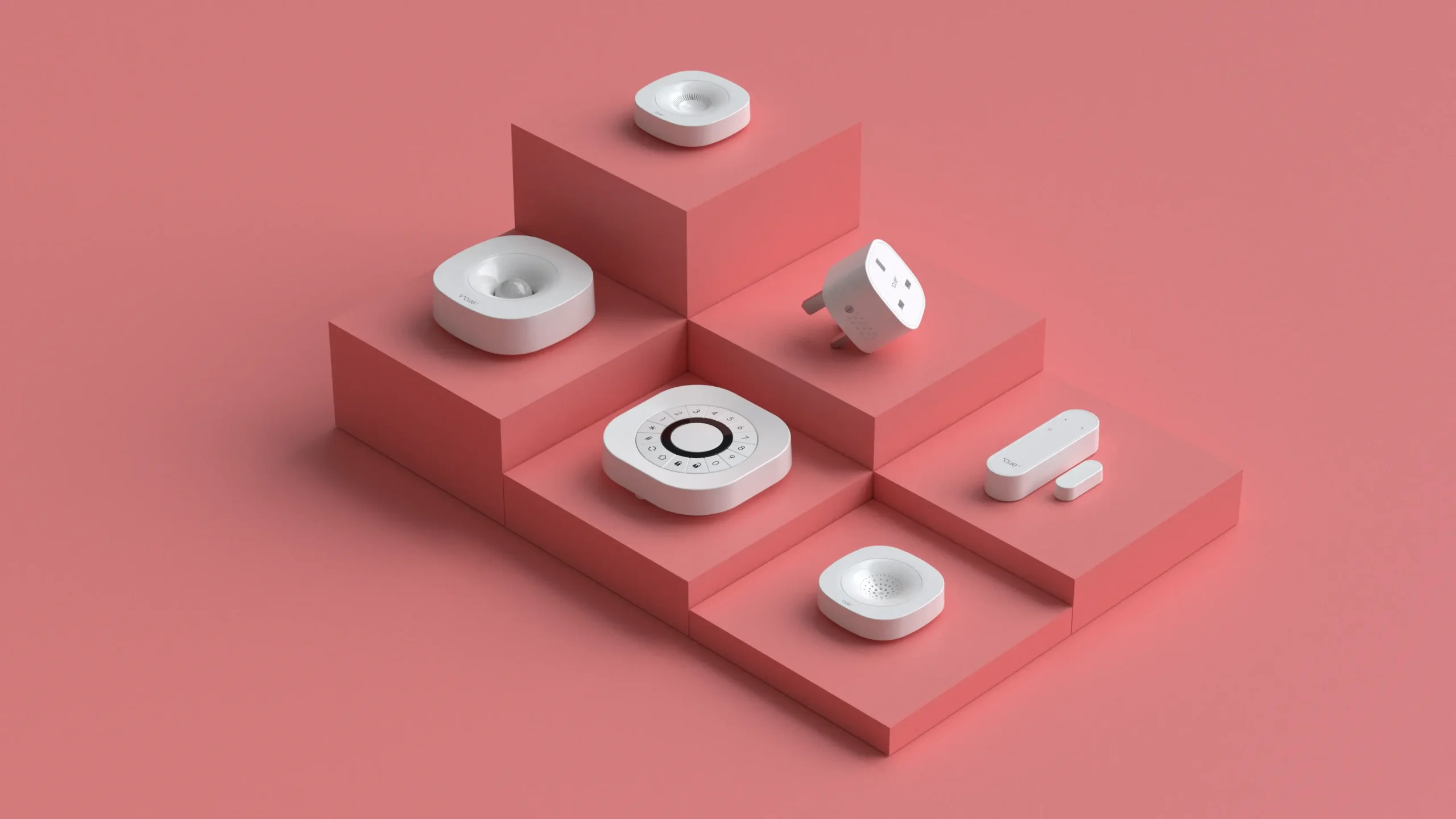
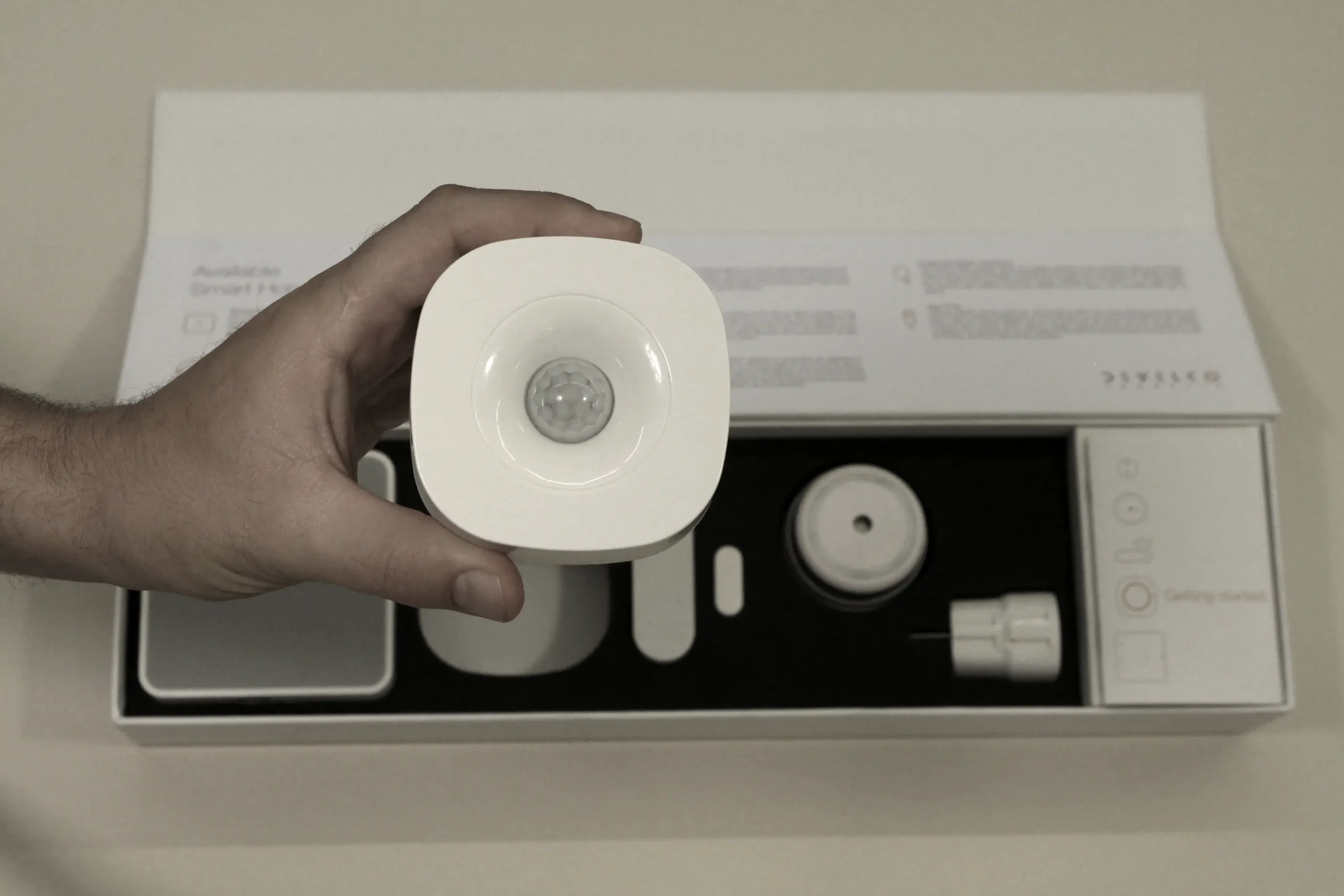
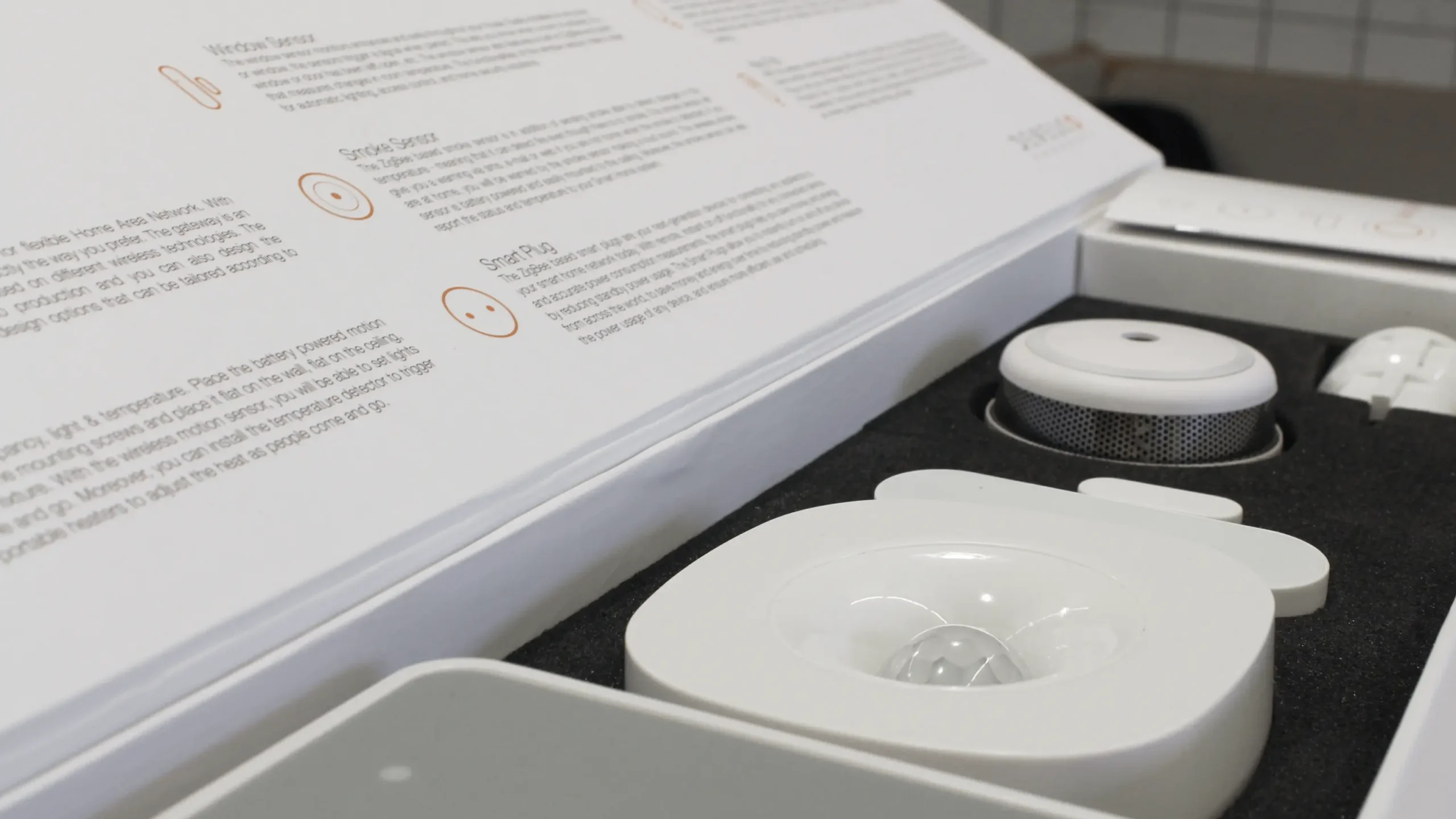
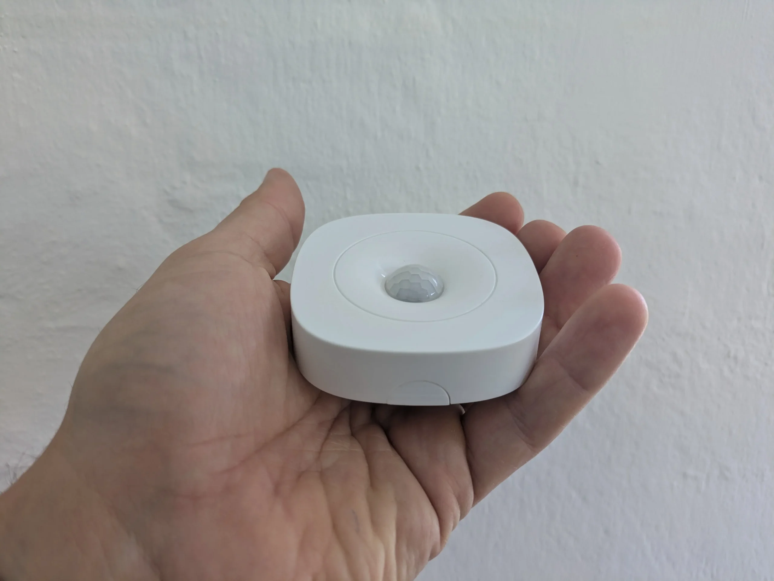
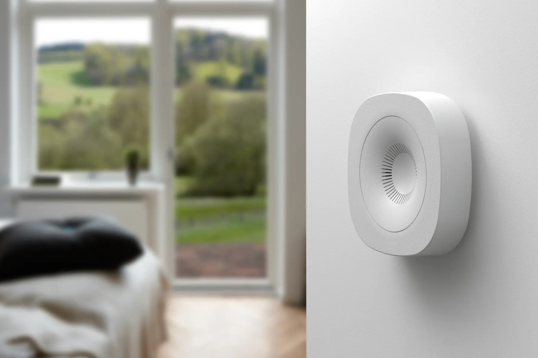
Made By Makers helped Onics develop a motion sensor designed to become a central part of almost any smart home setup, sensing movement, light, and temperature. The challenge was to create a product that could live in people’s homes for many years and seamlessly fit into different interiors while having an iconic visual identity to differentiate itself in an increasingly crowded market.

At the same time, the goal was to establish a strong, long-lasting design DNA for future Onics products. By defining clear building blocks of form, proportion, mounting and assembly principles, and CMF, the design should create a scalable visual language that could inspire and guide the development of the future Onics product portfolio.

Our role

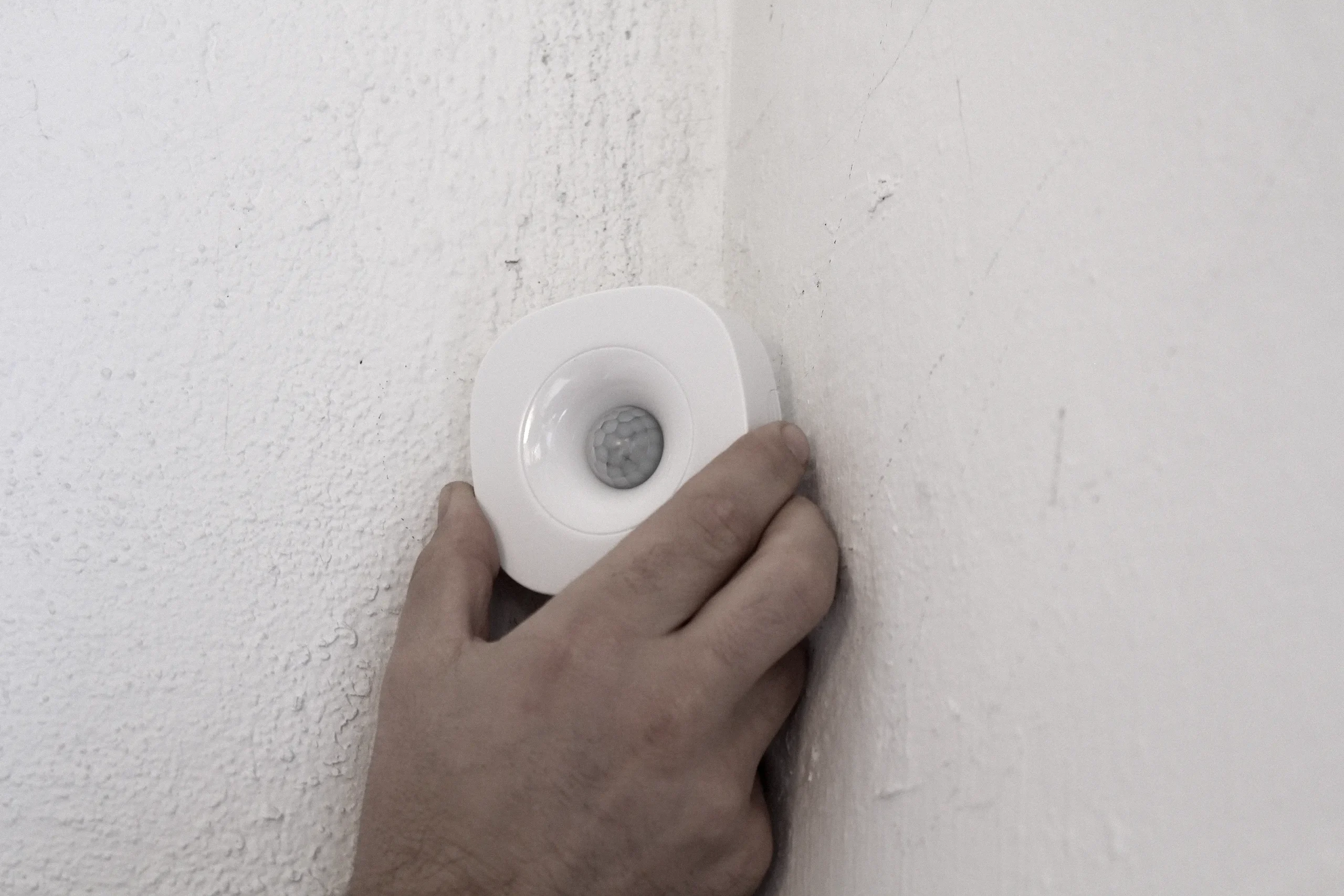
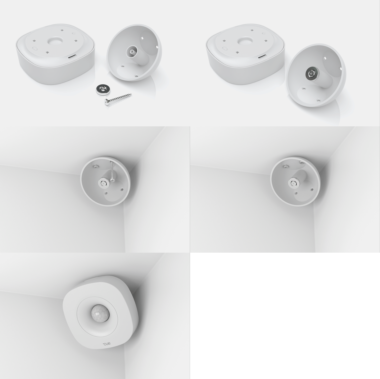
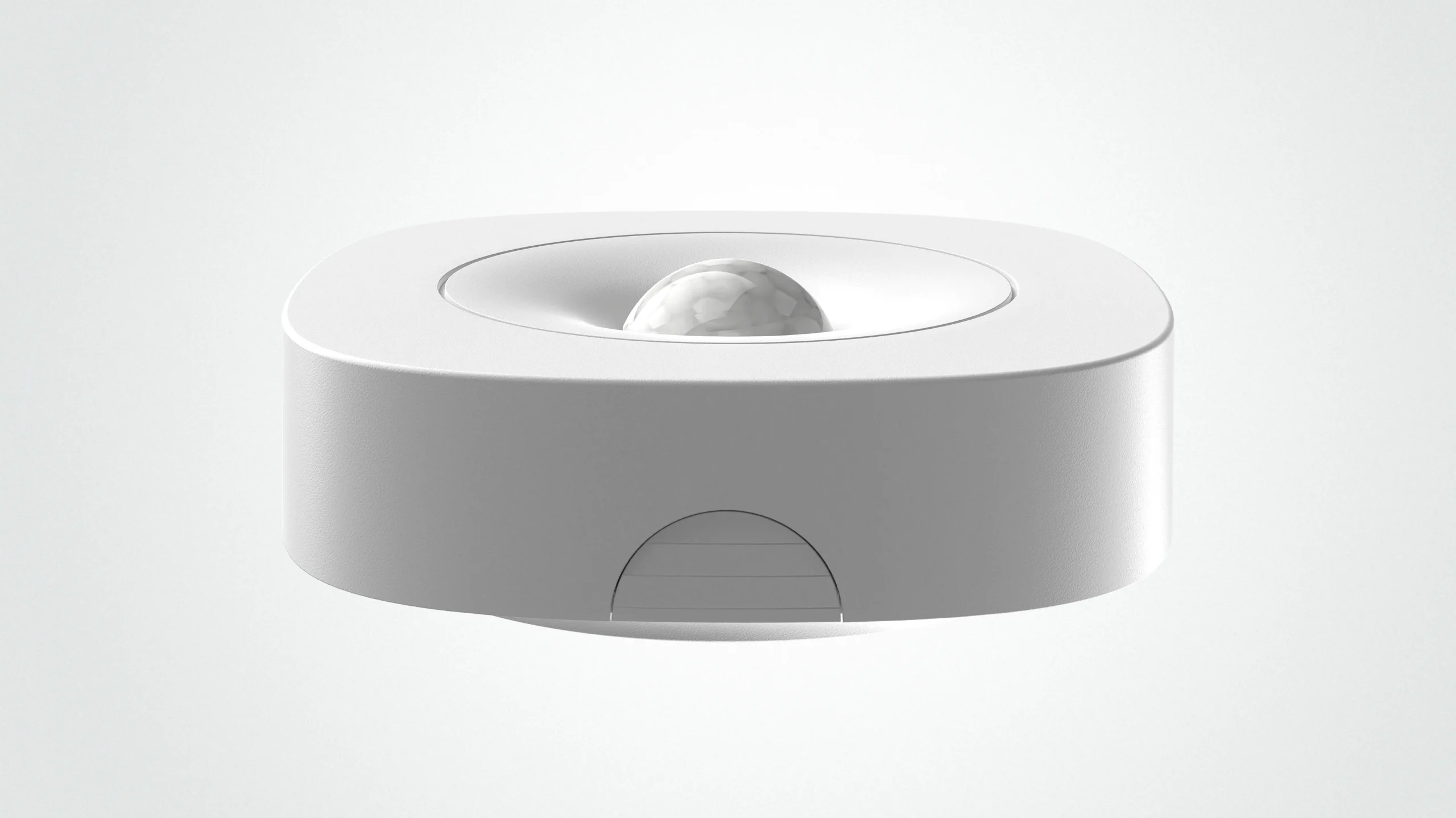
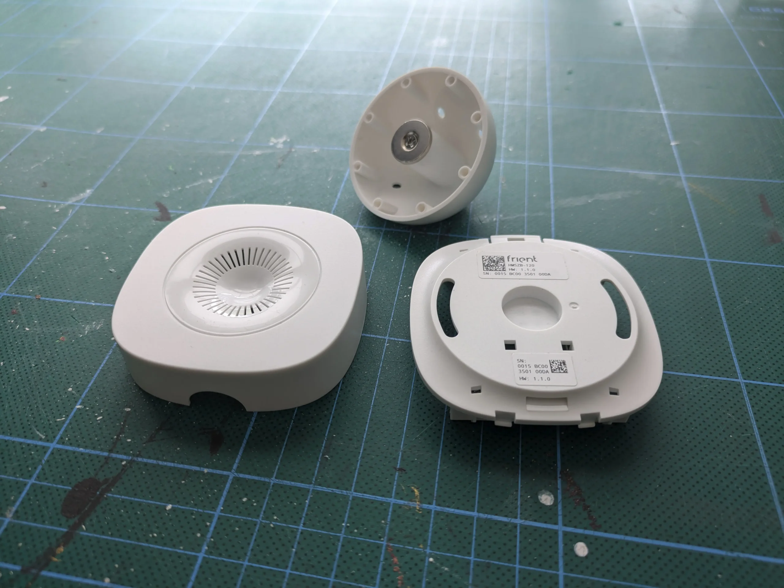
Our role was to establish a strong and iconic visual identity for the sensor while ensuring that its physical interaction and installation were equally considered. We ensured the design DNA of the motion sensor could function as a foundation for future designs of a larger Onics product family. We developed practical features including an intuitive open-and-close mechanism and a versatile corner mount, allowing the sensor to be positioned in locations that would otherwise be difficult to access.

Process

The design process began with expert interviews to understand how people perceive sensors and electronic devices in their homes, and what makes them feel either intrusive or naturally integrated. We then explored a broad range of aesthetic directions and visual universes to identify the right balance between Onics’ brand identity, functionality and the diverse environments in which the sensor would live.

Result

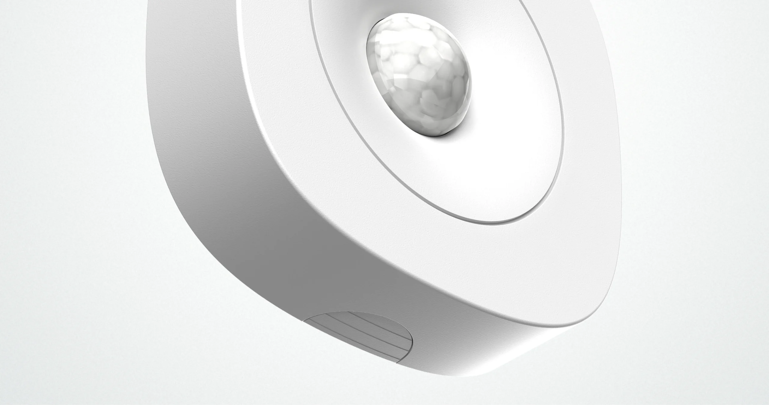
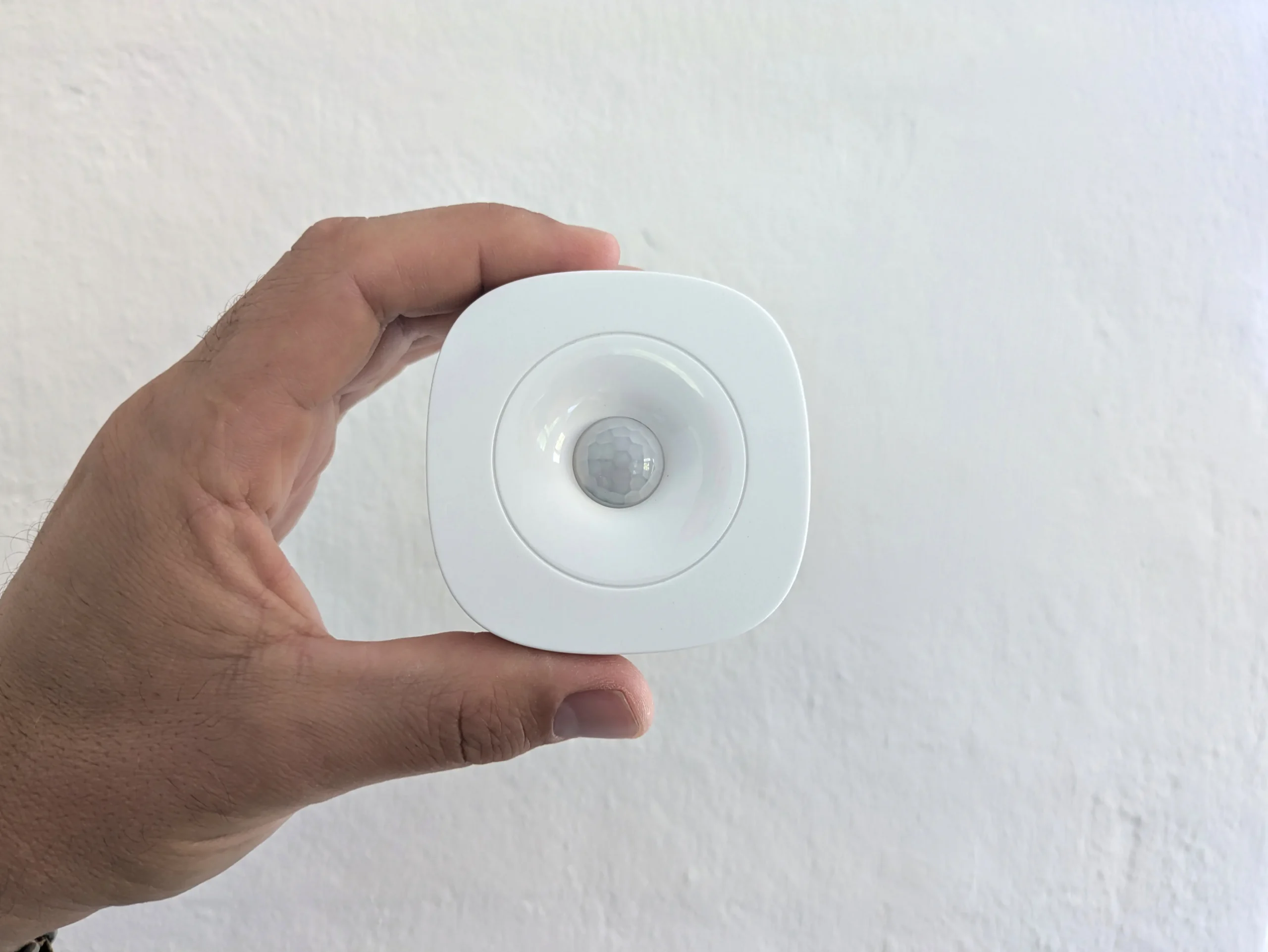
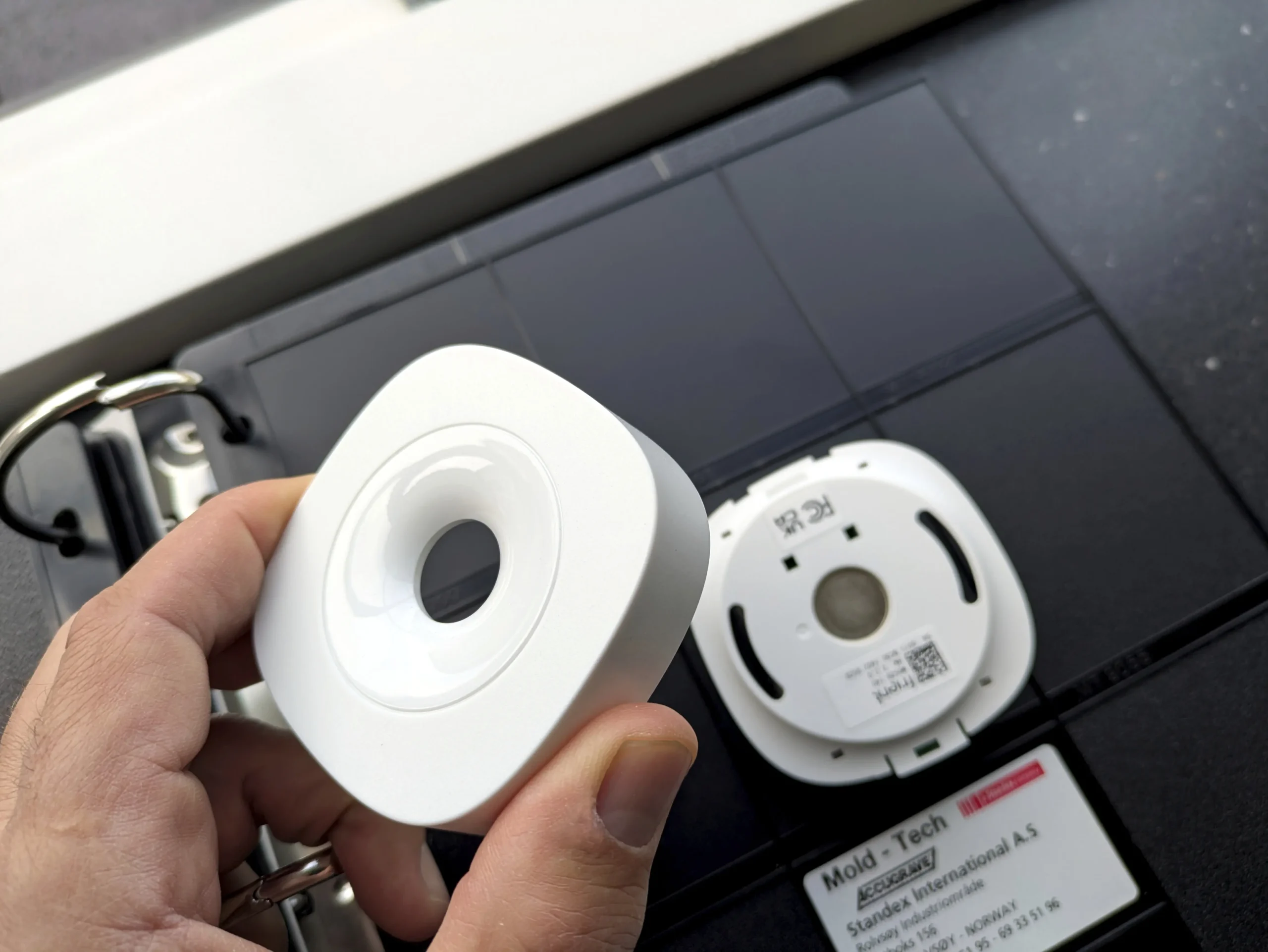
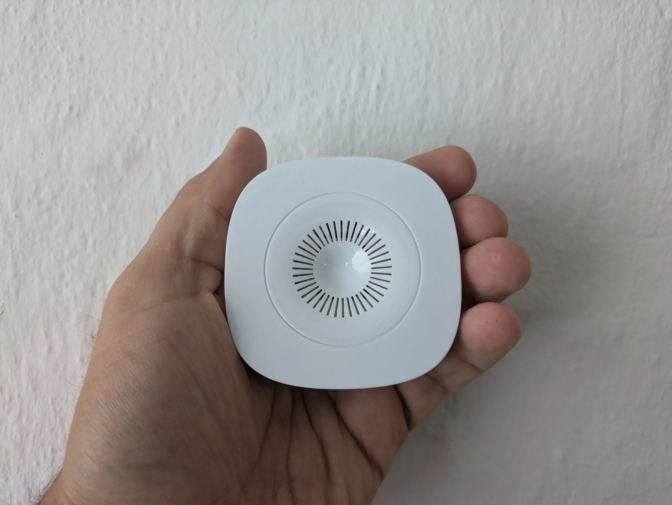
The result is a distinctive yet calm and unobtrusive product identity. The sensor combines an iconic visual expression with a minimalistic form designed to integrate naturally into the home. The shape is an extruded squircle with a concave funnel empathizing the PIR sensor. A discreet debossed circle marks the transition from the flat top surface and the concavity.Over the years, the product has proven its broad appeal, attracting users across international markets and finding its way into both private homes and professional environments. The design DNA of the motion sensor became a foundational design principle for almost all subsequent Onics products, ensuring a strong and consistent brand identity across the entire product range.

Client

Onics delivers comprehensive B2B IoT solutions, providing the hardware, software, and cloud platforms that power smart home, energy management, and healthcare technologies. They specialize in white-label devices -including gateways, sensors, and smart plugs - allowing businesses to seamlessly brand and deploy their own connected solutions.

Onics Air Quality Sensor

Services

-> Design DNA
-> Product design
-> Design for manufacturing

Client

Onics

Year

2015

The challenge was to design a wall-mounted Air Quality Sensor that could continuously monitor the surrounding air without requiring any interaction from the user. As the product is always present in the background, the design needed to feel discreet and unobtrusive while still communicating a clear and intentional product identity. The design DNA established when designing the motion sensor should be the main driver for the visual expression.

Our role

Our role was to create a design where functionality and aesthetics were closely integrated. A key challenge was finding the right way to allow air to flow freely into the sensor while keeping the electronics and internal components protected. Rather than treating the necessary perforations as a purely functional detail, we explored how they could become an essential part of the product’s visual identity.

Process

A significant part of the design process focused on the perforation pattern. We explored different sizes, shapes, densities, and arrangements to balance airflow, technical requirements, manufacturability, and visual expression. The aim was to create a perforation language that felt natural and refined while making the airflow openings an integral part of the overall aesthetic.

Result

The result is a wall-mounted Air Quality Sensor where the perforations become a defining design element. The openings are cut in the concave funnel which gives them a subtle curvature. They allow the sensor to continuously sample the surrounding air while creating a distinctive and recognisable surface. The product remains visually quiet on the wall, yet its functional purpose is subtly expressed through the design itself.

Client

Onics delivers comprehensive B2B IoT solutions, providing the hardware, software, and cloud platforms that power smart home, energy management, and healthcare technologies. They specialize in white-label devices -including gateways, sensors, and smart plugs - allowing businesses to seamlessly brand and deploy their own connected solutions.

ABB Niessen

Services

-> Product design
-> Design for manufacturing
-> Design trend research and brand visuals

Year

2024

Image credits

ABB Niessen

ABB is a global leader in electrification, providing high-quality sockets, switches, and wiring accessories for residential, commercial, and industrial applications. Known for combining safety, reliability, and modern design, ABB delivers solutions used in projects around the world.

“

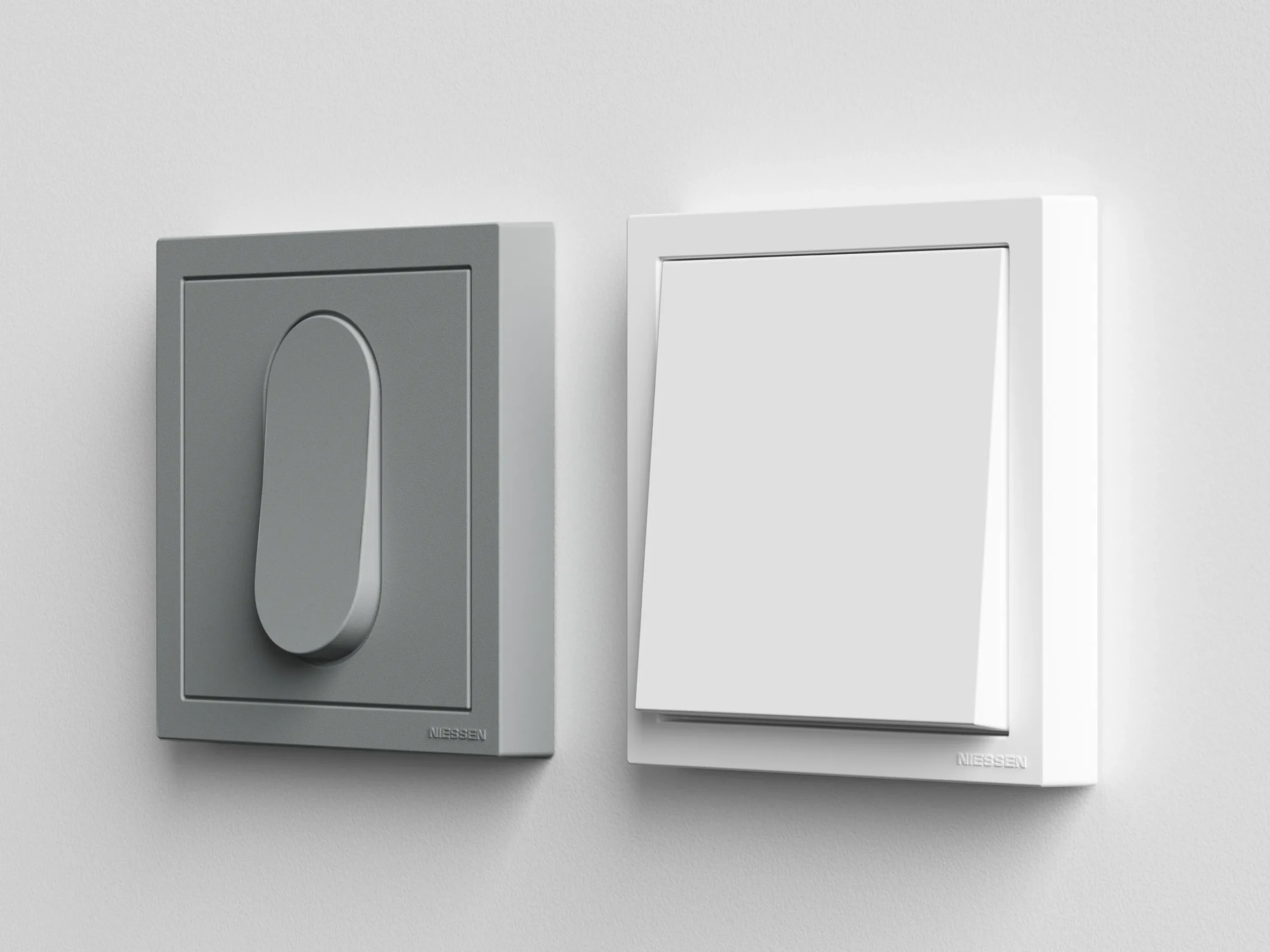
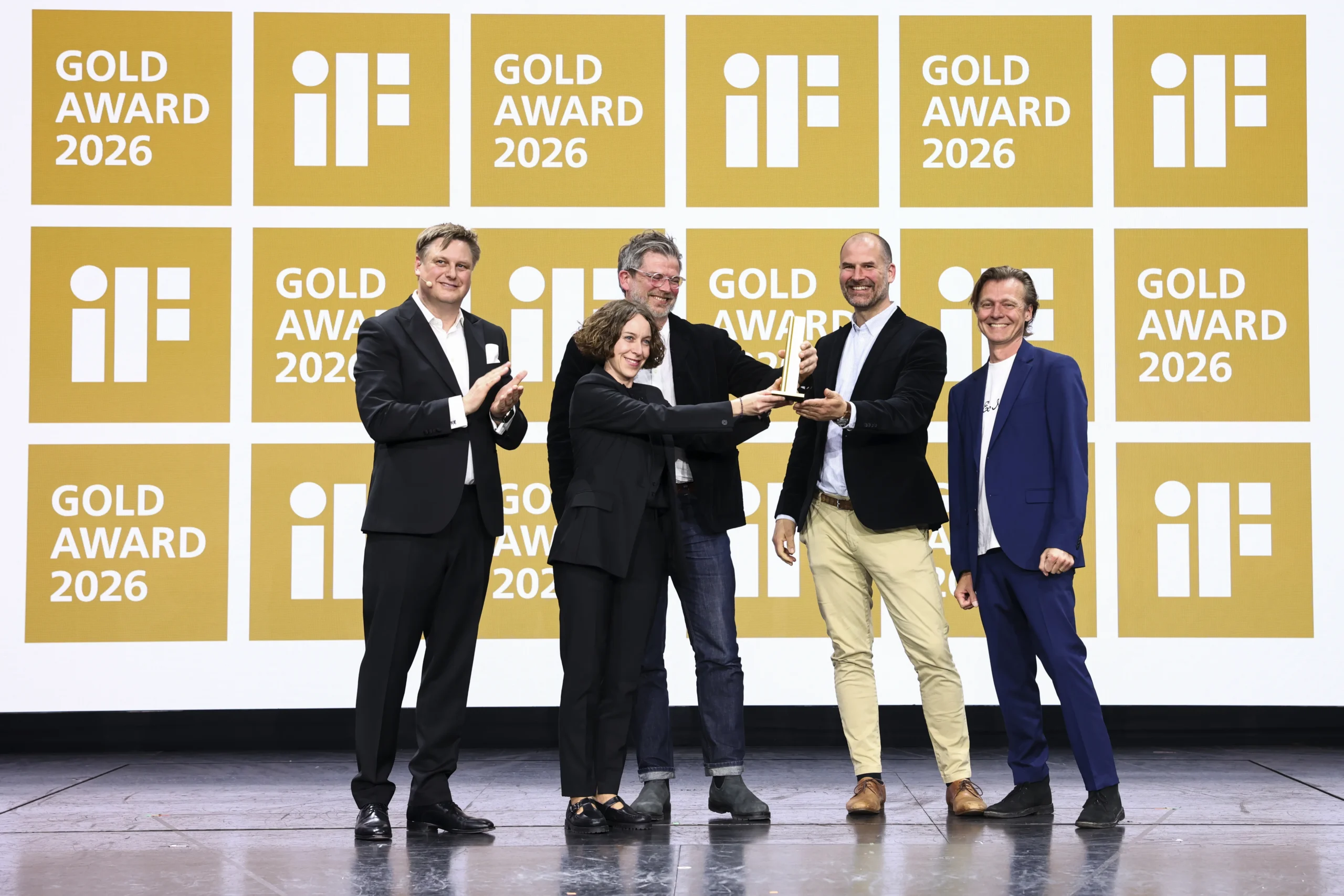
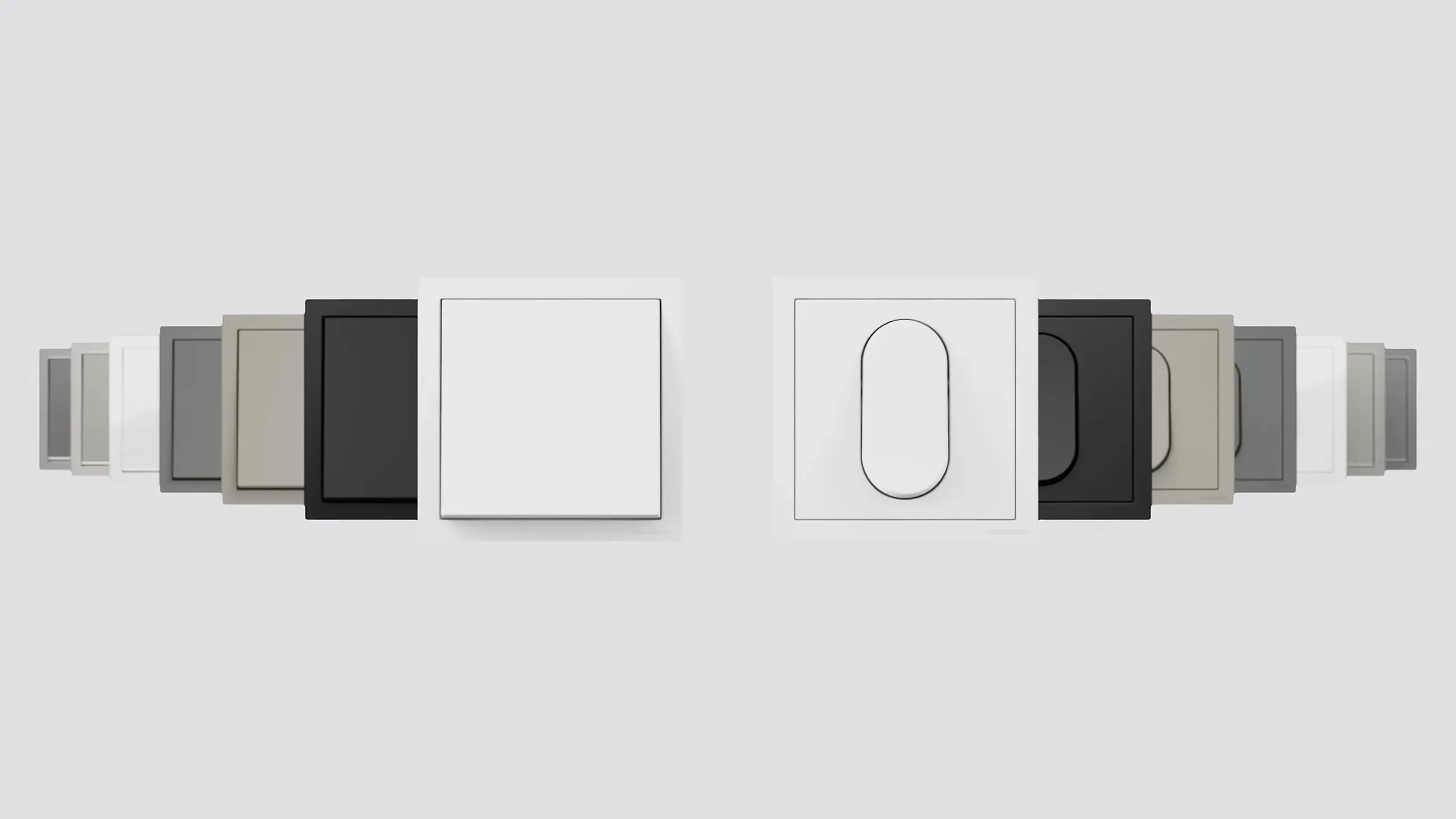
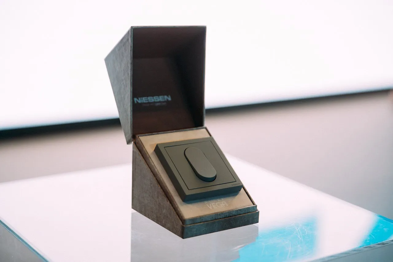
The carefully designed switch system combines clear geometry with subtle softness - a successful combination of functionality and aesthetics. Thanks to a sophisticated color palette and a focus on sustainability, the VEGA and ALTER VEGA series can be adapted to many architectural contexts. This outstanding design shows that small details can make a big difference.

- Statement by the IF Jury

Challenge

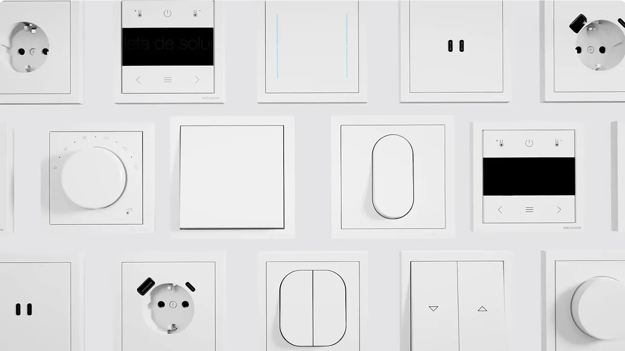
ABB Niessen aimed to develop a new series of switches and sockets with a clear, modern design direction, while staying rooted in the archetypal rocker switch as a core design principle.

Our role

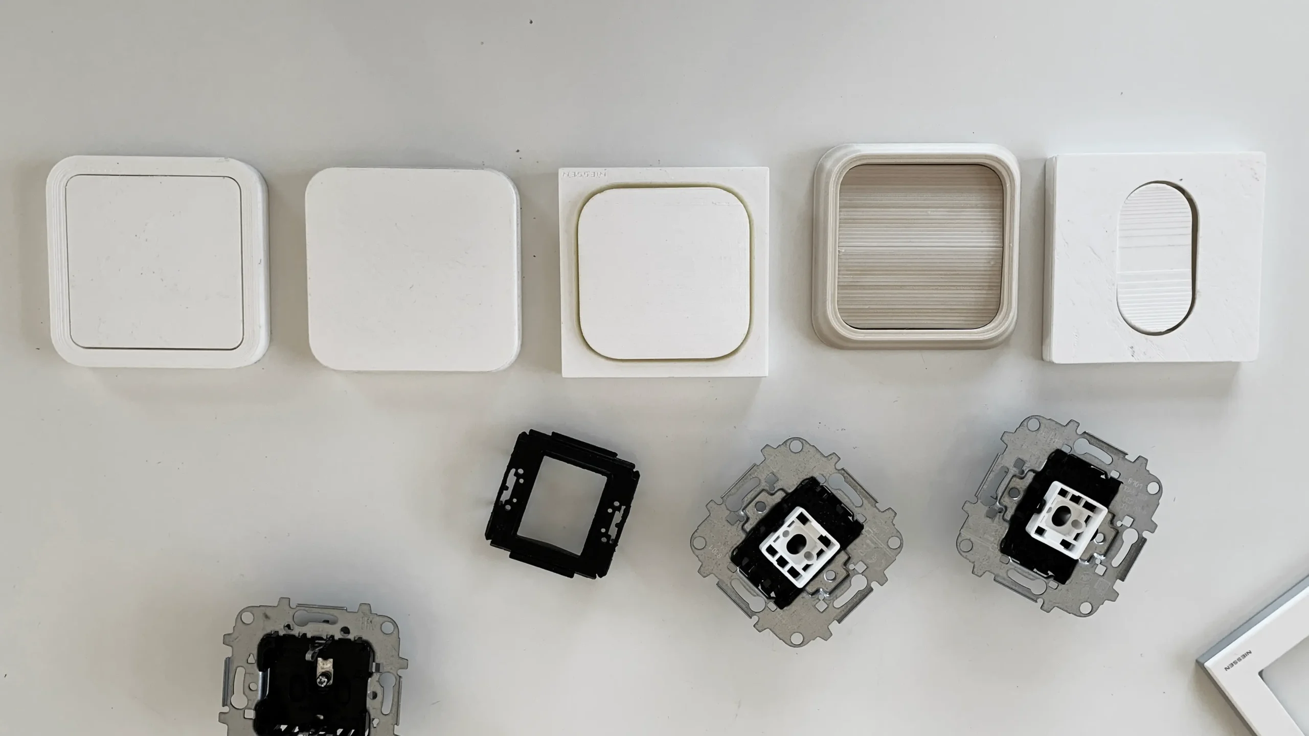
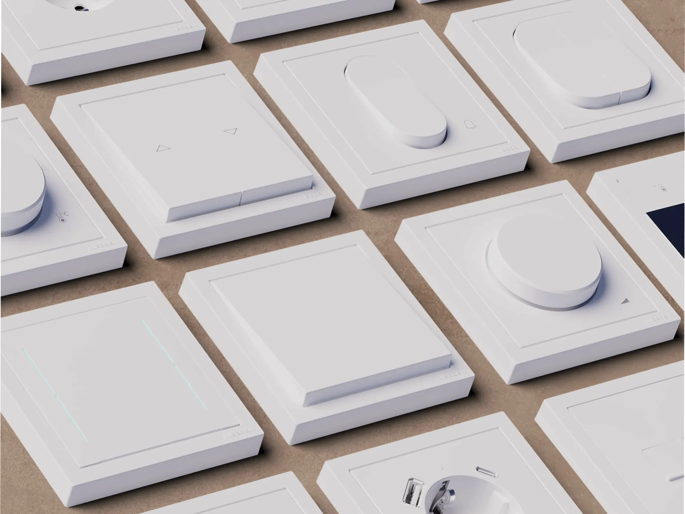
We developed two design directions within a shared system: Vega and Alter Vega. The focus was to create a flexible product family combining simplicity, high quality, and a balance between subtle integration and more expressive character.

Process

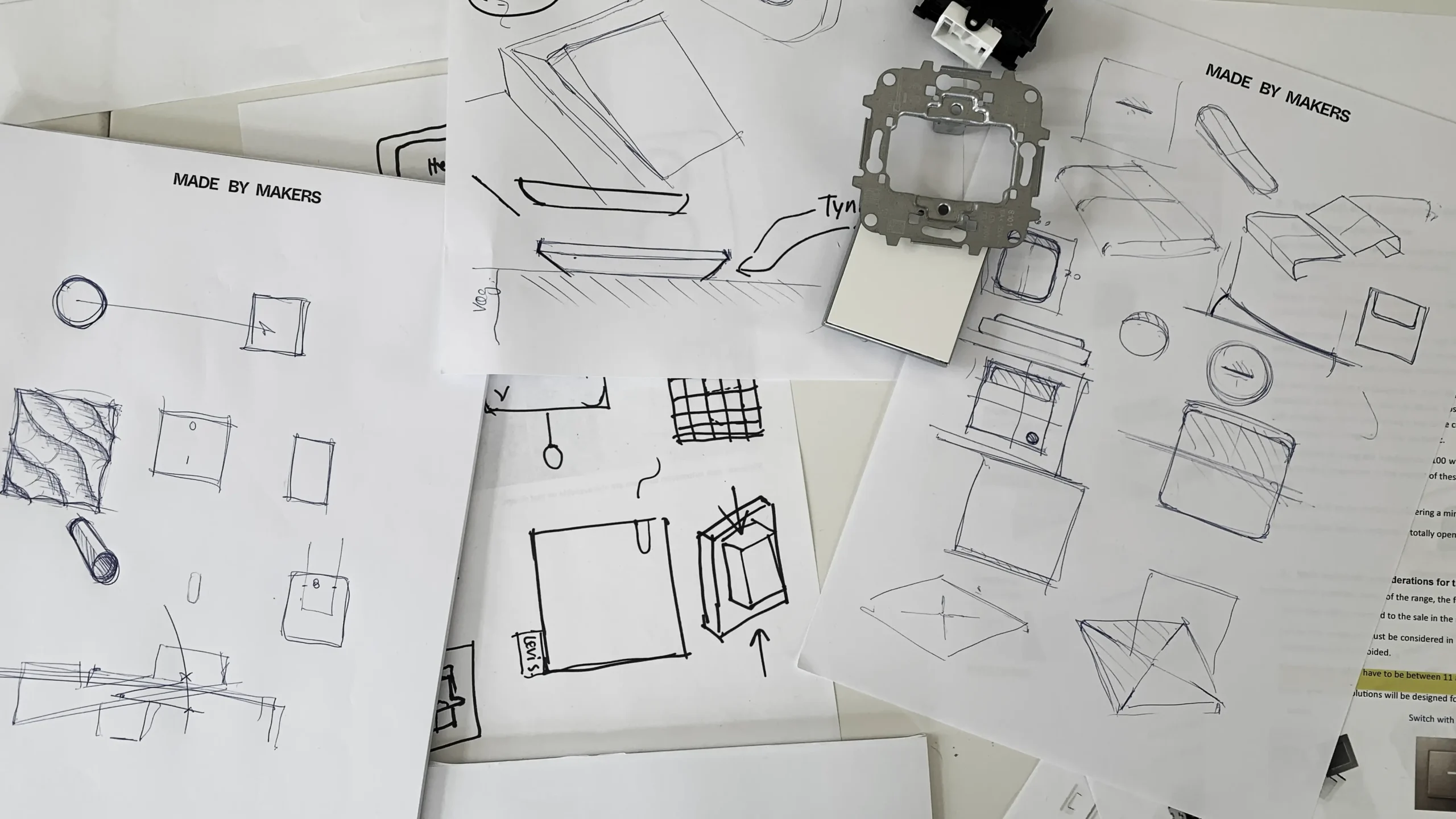
The process was driven by extensive research into user contexts, trends in materials and movements in the global society. These insights were translated into tangible and actionable design principles and refined through iterative design loops, resulting in a coherent form language and a complete CMF specification.

Result

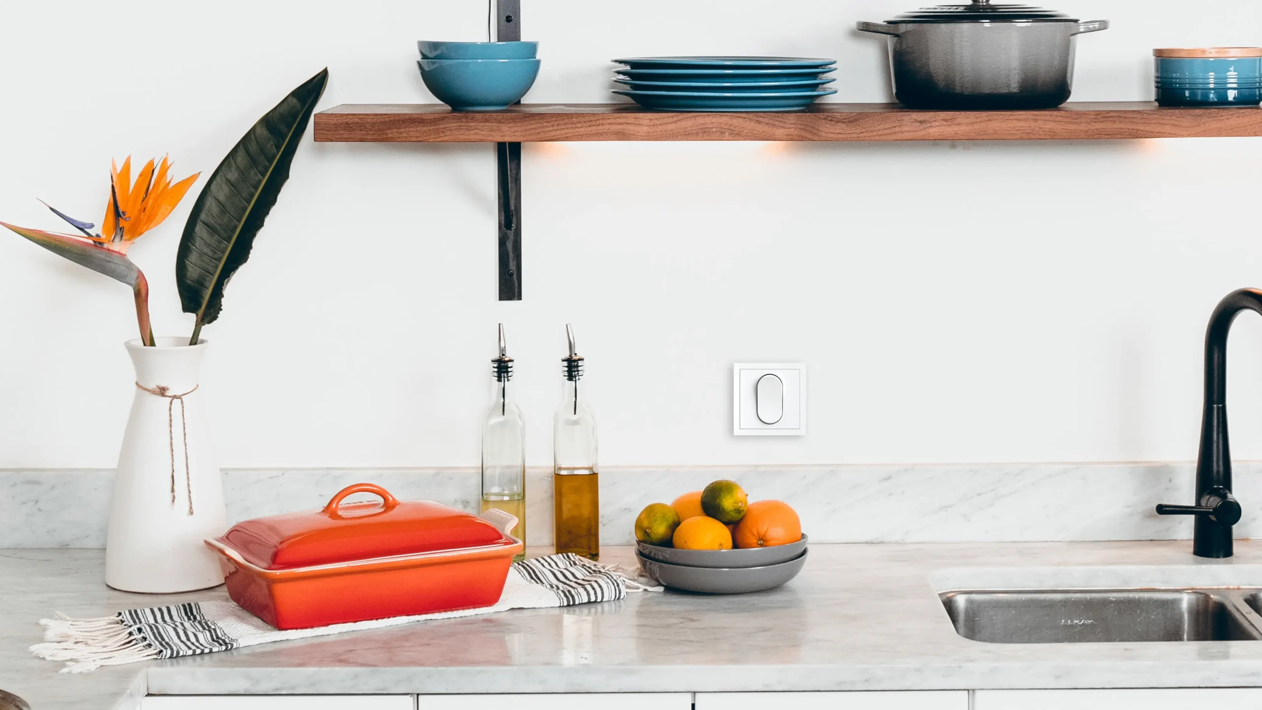
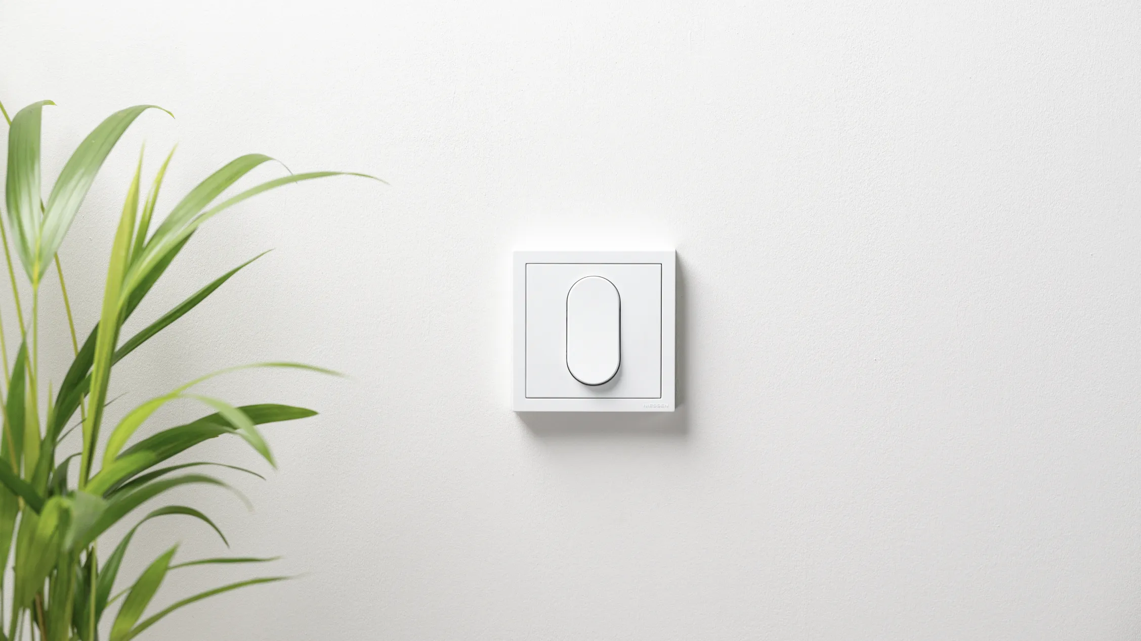
The outcome is a versatile product series with two distinct expressions built on a shared platform. The range combines timeless design, functional clarity, and a CMF strategy that supports longevity and broad applicability across different environments.

Explore more

View examples of our client cases

Work with us

You won’t find the usual agency case parade in here
but please find this invitation to get in touch:

Let's
connect

mbm_gitm_blank_flesh

Write us

hello@mbm.niobabuild.dk

Call us

+45 86 12 10 44 / +45 21 76 00 57

Visit us

MADE BY MAKERS ApS
Grumstolsvej 4F, 1st floor
DK-8270 Højbjerg
Denmark

MBM_Logo_V1_Pos_flesh